Has anybody tried to extend the Menu on Management Portal? I like to add a new page or a dashboard that will be created soon to the Management Portal and allow others to use it also. I understand there are risks that I could lose things during an upgrade. I am okay with that. Does InterSystems support such an effort?
Hi, I'm new to the Analytics world in Intersystems and was attempting to print and/or export selected rows from a detail listing in a pivot on a dashboard. I am able to print and/or export all the rows; but if I select a specific set of rows, it prints out the entire detail listing; not the selected rows. Please advise on the best approach to accomplish this task. Thanks.
Scenario-1: How to add filter or where clause while displaying data with listing fields ( I have not used Custom SQL listing to display this data).
For below table, I have created a Cube Student and I have created listing fields of the columns mentioned in the table. Also I have created the pivot and I am able to create the same table as shown below.
Creating information dashboards, pivot tables, and widgets is an important step in analysis that provides valuable sources of information for informed decision-making. The IRIS BI platform offers many opportunities to create and customize these elements. In this article, we will take a closer look at the basic techniques for developing them and the importance of using them.
When analyzing data, there is often a need to look at specific indicators more thoroughly and to highlight sections of information of particular interest to a user.
For instance, examining the data dynamics for specific regions or dates can help us uncover some hidden trends and patterns that will allow us to make an informed decision about our project in the future.
Our team is working on building dashboard for internal reference and monitoring.
We would like to have details like Interface Name, Current Status, Last Messages Processed at, IP & Port, Serve/Instance/Production Environment name etc.
If there is any built-in service which we can utilize or any pre-compiled code that we can utilize to build such dashboard.
At this moment want to keep it basic, but moving forward will enhance with more advance features.
I am wondering if anyone has created a custom dashboard that can be accessed outside of the Ensemble environment. What I am looking to do is create a dashboard accessible from a person's computer, on the same company network as Ensemble, that can display information regarding specific services, operations, processes, queues, etc. I don't want to give a user access to Ensemble, just allow them to display a page in their browser to give them the information they need to make sure their processes are running.
Suppose I created a new DeepSee class to display a new item in the dashboard.
DeepSee.Component.datePick
Wich, in general, is just a copy of a similar class in %ZEN with minor changes. I need to include it in the base install. How can i do this? Am I ever allowed to change the composition of system classes?
Released with no formal announcement in IRIS preview release 2019.4 is the /api/monitor service exposing IRIS metrics in Prometheus format. Big news for anyone wanting to use IRIS metrics as part of their monitoring and alerting solution. The API is a component of the new IRIS System Alerting and Monitoring (SAM) solution that will be released in an upcoming version of IRIS.
I built a dashboard to show hourly instrument capacities based on a term list. The term list consists of the TestInstrumentID and the number of tests that instrument can perform in 1 hour. The calculation works correctly and the data is accurate but periodically if you go to check the dashboard the percentages all get changed to 100% across every hour. If you check it later or add an additional site to the filter then the percentages correct themselves. I don't know what's causing this or how to troubleshoot it because it does calculate correctly but is not consistent.
The following steps show you how to display a sample list of metrics available from the /api/monitor service.
In the last post, I gave an overview of the service that exposes IRIS metrics in Prometheus format. The post shows how to set up and run IRIS preview release 2019.4 in a container and then list the metrics.
This post assumes you have Docker installed. If not, go and do that now for your platform :)
I would like to define an advanced filter within my pivot table that allows me to look at diagnosis codes, or at procedure codes - but I do not want to hard code values within the pivot table definition (get the %OR defined).
I would like to be able to allow my dashboard user to chose what specific diagnosis codes or procedure codes they are interested in. So for example one user may want to look for # of patients with cancer dx or patients who have had a radiation procedure.
How can I accomplish this OR feature using dashboard filters?
It is very interesting to compare different BI technologies. It is curious to me what the differences are in functionality, development tools, speed and usability.
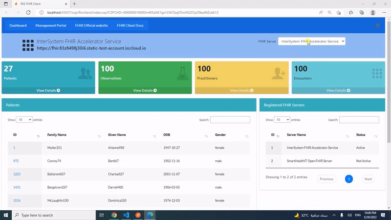
This post is a introduction of my open exchange iris-fhir-client application.
iris-fhir-client can connect to any open FHIR Server by using embedded python with the help of fhirpy Library. Get Resource information by terminal and by using CSP web application.
We are happy to share interesting information with you, as well as tell you why Python is good, where it is used.
Among the most used libraries are NumPy and Pandas. NumPy (Numerical Python) is used to sort large datasets. It simplifies mathematical operations and their vectorization on arrays. Pandas offers two data structures: Series (a list of elements) and Data Frames (a table with multiple columns). This library converts data into a Data Frame, allowing you to remove and add new columns, as well as perform various operations.
I'm trying to get my Combo Chart to dynamically scale the Y axis, but it's not doing what I would like. The 1st Y series, if the MAX value is set to null, scales the chart and the series fine, but then the subsequent Y axis are not to that same scale. Each "null" Max'ed series is setting it's own scale based only on it's own ranges and not in sync with anything else.
Is there a way to force all of the "null" scaled columns to be in the SAME scale as each other AND be dynamic.
This post is a introduction of my openexchange iris-python-apps application. Build by using Embedded Python and Python Flask Web Framework. Application also demonstrates some of the Python functionalities like Data Science, Data Plotting, Data Visualization and QR Code generation.
Features
Responsive bootstrap IRIS Dashboard
View dashboard details along with interoperability events log and messages.
Maybe someday you will need to use Adaptive Analytics but there is little information about this, so I decided to write an article on how to start developing a dashboard on Tableau using the Atscale cube.
I'm happy to share with the community a web server log dataset from our longtime customer, an operating company.
Their webserver operates on Apache webserver and contains data which can be useful to analyse a load and search engines activity.
After installing the project, you will get the data for a few months that can show a typical load and activity of clients, robots and also you can see how it depends on day of week, holidays and time of a day.
I regret getting a late start in the InterSystems Analytics contest. I had tried a couple of times before to use Analytics, but I had not gotten too far. I have been recording financial transactions in Excel workbook ever since I had to retire Microsoft Money. Since my iris-for-money was not fully functional, I created a worksheet per account I was tracking. I had developed a CSP page in iris-for-money to import transactions by reading a CSV file.