Basics of creating dashboards, pivot tables and widgets on IRIS BI platform
Creating information dashboards, pivot tables, and widgets is an important step in analysis that provides valuable sources of information for informed decision-making. The IRIS BI platform offers many opportunities to create and customize these elements. In this article, we will take a closer look at the basic techniques for developing them and the importance of using them.
1. Dashboards:
Dashboards are visual tools that combine different data in one interface for more effective monitoring and analysis. Creating a dashboard on the IRIS BI platform involves several key steps:
- To start, click the "+" image at the top of the working area on the portal's home page.

- Then select the "Add Dashboards" line in the list that appears on the left.
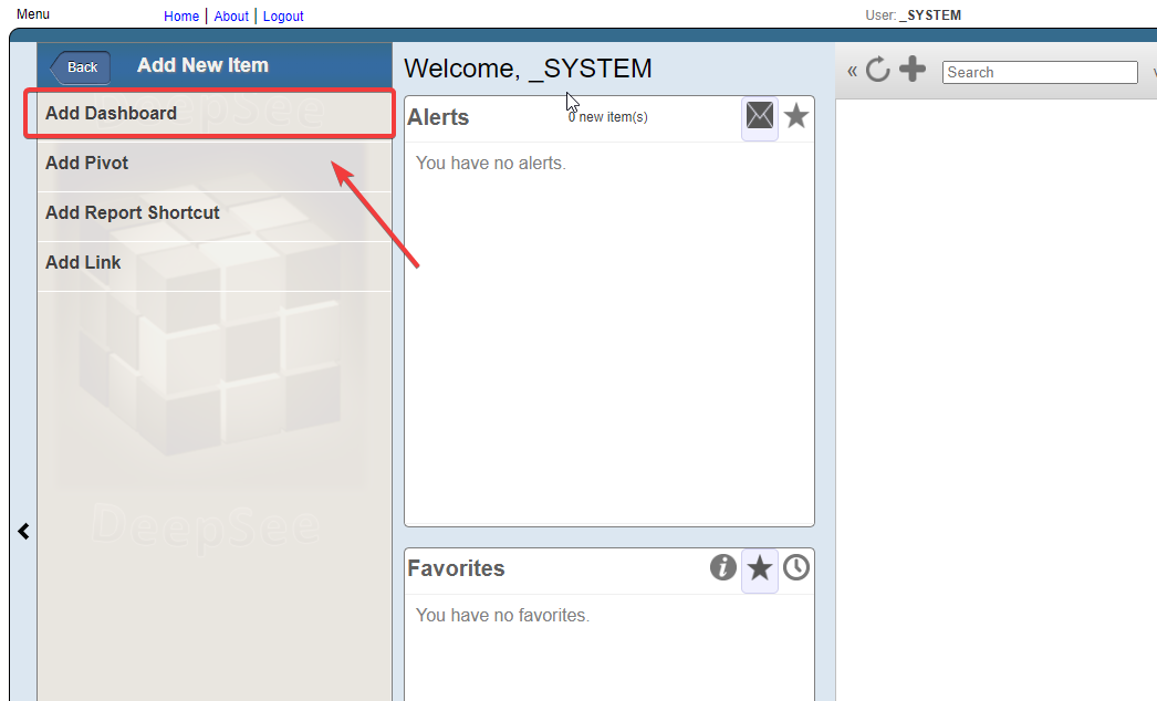
- Next, specify the name of the folder where the dashboard will be located in the "Folder" field, and type the name for the dashboard in the "Name" field.

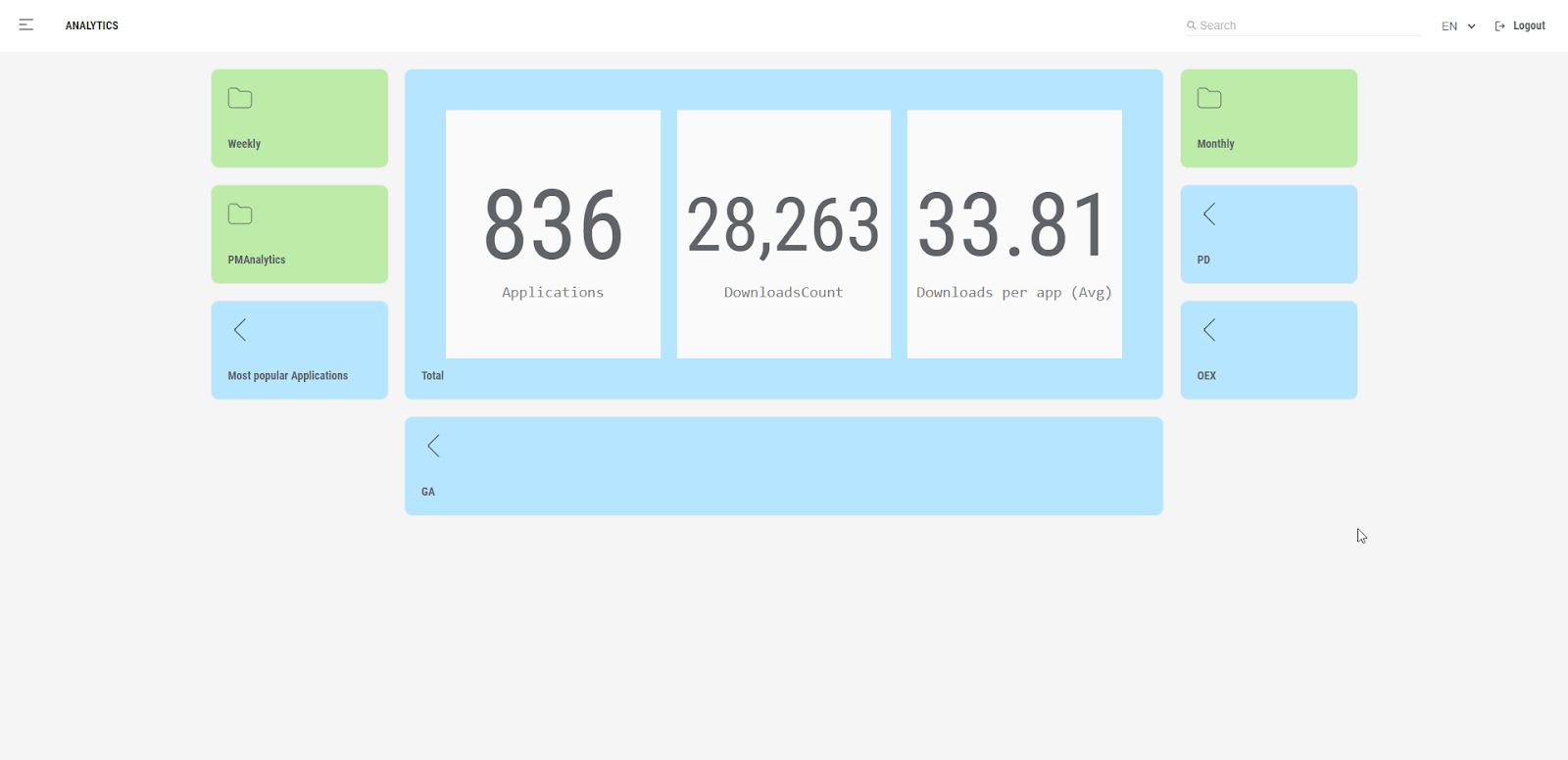
It's great that we have just created a working dashboard for our first dashboard! This step is an essential achievement in the process of implementing analytics and improving our ability to interpret and use data.
Creating a dashboard opens up many opportunities for us. We can now visualize our data and metrics more clearly and make decision-making easier.
2. Pivot Tables:
Pivot tables are a powerful tool for aggregating and analyzing data in tabular form. Creating a pivot table on the IRIS BI platform also has several key steps:
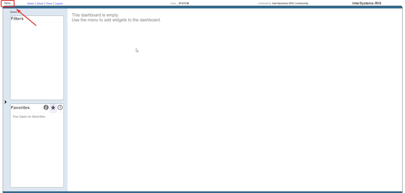
- While on the main window of our dashboard editor, open the menu by clicking the corresponding word "Menu" in the upper left corner.
- In the list that appears, select the "Analyzer" field.
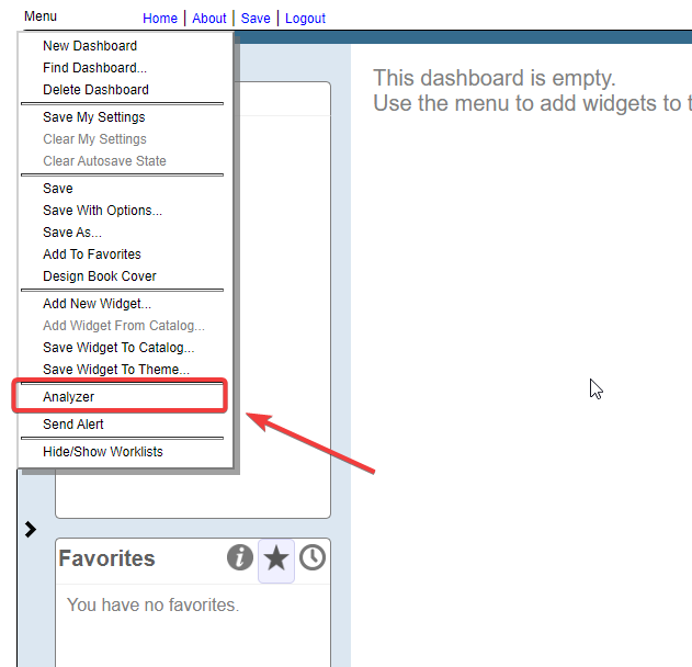
- It will take us to the pivot table editor of the IRIS BI management portal.
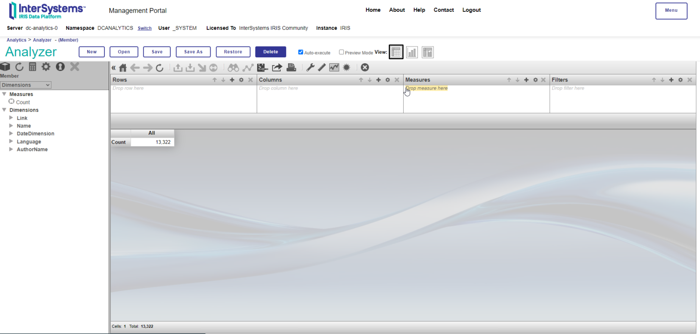
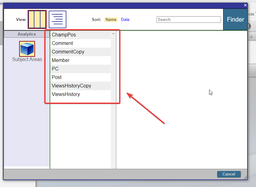
- Let's start by selecting the data source. It can be a "cube" containing the data we need. To do this, click the image of the "cube" in the upper left corner.

- Then select the data area you want to use.
- Determine what data you want to aggregate in the pivot table. It includes selecting such analytic functions as sum, average, quantity, and others that will be applied to the data.

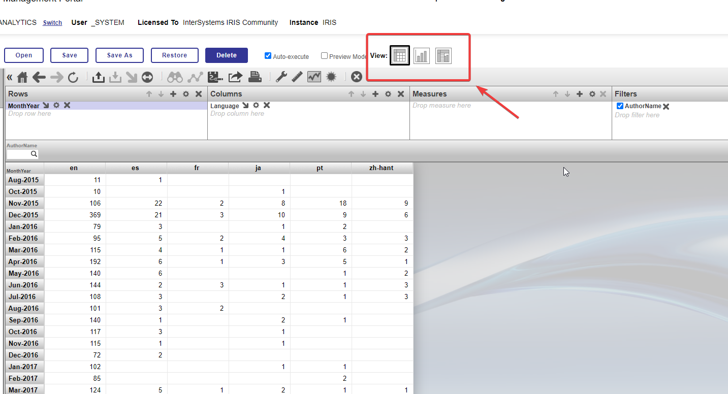
- In a pivot table, you can define which fields will be used in the rows and columns of the table. It allows you to analyze the data in terms of different parameters.

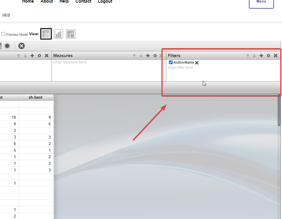
- Apply filters and sorting to customize the data displayed in the pivot table. It allows you to focus on specific aspects of the data and simplifies analysis.
- In addition to tabular data presentation, you can also use graphs and charts. It makes data analysis more visual and understandable.
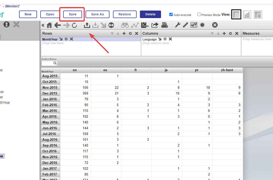
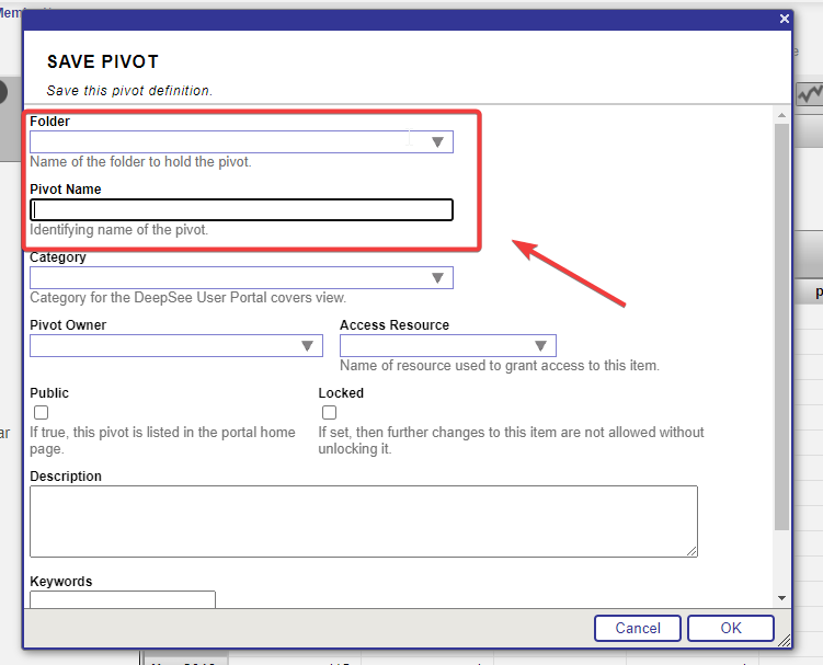
- To save the pivot table, click the "Save" field and specify the necessary folder and the name of the pivot table in the newly opened window.
How great it is that we have created a pivot table! This tool is a real asset to our business intelligence and will help us explore and analyze our data in a more profound and systematic way.
Creating a pivot table gives us the following opportunities:
- Deeper data analysis: We can now easily view and analyze data in different slices and with various aggregation functions, allowing us to identify hidden patterns and trends.
- Quickly track changes: We can instantly react to alterations in data and make swift decisions through flexible filters and sorting.
- Improved awareness: A pivot table makes data more accessible and legible for all team members. It promotes shared understanding and collaboration within the company.
- More accurate planning and budgeting: Analyzing data with the help of a pivot table lets us understand past performance better. As a result, we can predict future events and make our business plans more accurate.
- Reduced analysis time: Pivot tables automate the process of data aggregation and analysis, which saves us time and resources.
3. Widgets:
Widgets are elements used to display specific data or graphical features on dashboards and reports. The IRIS BI platform provides a variety of widgets to meet different needs.
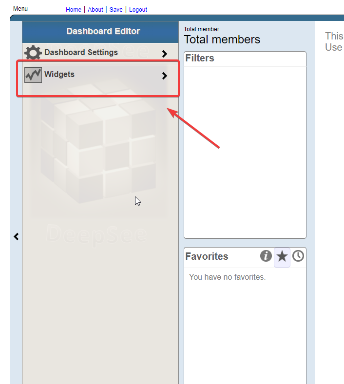
- To add a widget to our dashboard, we need to click the arrow on the left edge of the screen while in the dashboard editor.

- Then select the "Widgets" field.
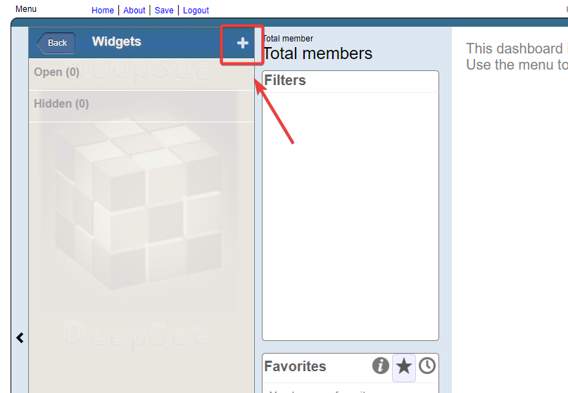
- Next, click the "+" in the menu that appears to choose the type of widget to add to the dashboard.
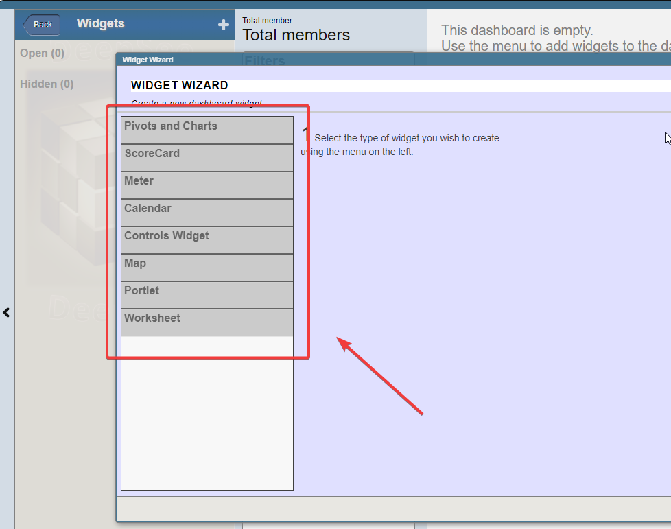
Each widget listed above represents an essential tool in business intelligence and data visualization. Let's take a closer look at each of them:
1. Pivots and Charts: These widgets allow users to analyze data in tabular format and visualize it as charts and graphs. Pivot charts authorize aggregation and filtering of data along with building dynamic reports. Graphs and charts make data more visual and help identify trends and patterns.
2. ScoreCard: This widget presents key performance indicators (KPIs) as cards with numeric values and statuses. We typically use them for monitoring important metrics and operational control.
3. Meter: These indicators demonstrate numerical values as graphical indicators resembling arrows on instruments. They let you quickly evaluate performance and results with the help of an intuitive visual representation.
4. Calendar: We utilize the Calendar widget to display data in the context of time. It can be beneficial when planning, tracking deadlines, and analyzing date-related events.
5. Controls Widget: This widget provides management in such forms as buttons, drop-down lists, and text boxes used to interact with data or perform particular actions on the dashboard.
6. Map: The map widget is employed to visualize geographic data.It can display the data distribution by location and help analyze geographic trends and patterns.
7. Portlet: It is a tiny widget that can be embedded in a dashboard or report. It can be a part of a larger information block and provide information or functionality on a specific topic.
8. Worksheet: This widget lets users enter, edit, and analyze data. It is practical if users want to interact directly with the data on the dashboard.
Each of these widgets has its own unique benefits and implementations, and their combination allows you to create information dashboards and reports that best fit your users' needs and data analysis objectives.
A word about the DeepSeeWeb platform:
DeepSeeWeb is a web client for viewing dashboards created in IRIS BI. It allows you to visualize data from MDX cubes in interactive dashboards with various widgets directly in your browser.
DeepSeeWeb does not currently have the functionality to create and edit dashboards. However, these functions are available in other IRIS BI components. DeepSeeWeb serves as a tool for convenient viewing of already existing dashboards.
DeepSeeWeb's main features:
- Easy viewing of dashboards created in IRIS BI
- Support of drill-down navigation for data drill-down
- Ability to share dashboards or individual widgets by embedding them on other sites

- Adaptability to mobile devices
- The capacity to use such popular visualization libraries as Highcharts
Thus, DeepSeeWeb is a tool that provides easy viewing of analytical dashboards built on the IRIS BI platform and allows you to visualize data interactively.
The importance of business intelligence on the IRIS BI platform:
Modern organizations face a tremendous amount of data, and the ability to analyze and exploit this data is becoming the main competitive advantage. The IRIS BI platform makes it possible for companies not only to store and process data but also visualize it in the form of information dashboards, pivot tables and widgets.
Using business intelligence on the IRIS BI platform has several criticaladvantages:
More Informed Decision Making: Dashboards and reports allow managers and analysts to see the current state of affairs in the company quickly and, thus, make informed decisions based on facts and data..
Reduce analysis time: The ability to filter, sort and visualize data makes the analysis process more efficient and saves time.
Increased transparency: Dashboards and reports allow all employees to see the big picture of business processes and company goals. It promotes better communication and understanding between different departments.
Reporting automation: IRIS BI makes you capable of creating automatic reports and schedules of data updates. As a result, it simplifies and speeds up the formation of accountability.
Forecasting and planning: Analytical tools on the IRIS BI platform enable data analysis and forecasting to help companies plan their actions and resources more accurately.
Performance Monitoring: Dashboards can be customized to monitor key performance indicators and respond quickly to changes.
Conclusions:
Creating dashboards, pivot tables, and widgets on the IRIS BI platform is a powerful tool for business intelligence and informed decision-making. It allows companiesto manage data effectively, identify trends and predict future events. By visualizing data and automating analysis processes, business users can easily interact with data and get relevant information to make strategic decisions. IRIS BI makes business intelligence more accessible and efficient for companies of all sizes, and this is a paramount competitive advantage in today's business environment.
Comments
Thanks for this useful article!