DC Feedback relates to discussions on Developer Community UI, UX and performance problems and enhancements.
On the homepage that we get when we go to https://community.intersystems.com/ there are three views, controlled by a set of buttons in the upper right:
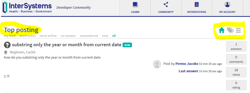
Above is with the default view (the "house", i.e. the "home").
I think the text "Top posting" would be better expressed as "Top posts" (plural), or maybe even just "Posts" (because what does "Top" mean when I'm viewing, say, "most active" or "most viewed"?).
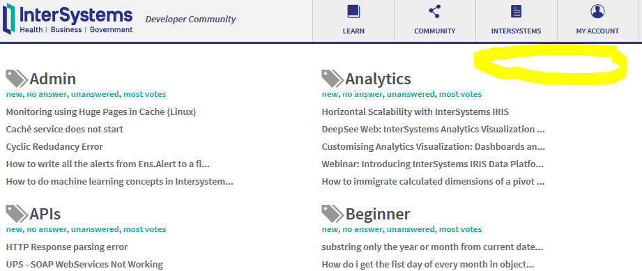
Also, when I pick the tag summary view ("tags" icon to the right of the "home" icon), the page doesn't offer me a way of switching to one of the other views ("home" or "compact"):
Hi, Community!
In 2017 we had 734 different contributors to Developer Community who posted articles and announcements, questions and answers.
This post is a compilation of Top Authors, Top Experts and Top Opinion Makers of InterSystems Developer Community in 2017.
It is a good guide "Who to Follow" in 2018.
And I'm glad to present these people!
Hi, Community!
Here is the digest of the best questions on InterSystems Data Platform in 2017.
In 2017 1,158 questions and here are Top 20 on most viewed, most voted and most commented.
Most viewed
WebSockets vs Long Polling vs Short Polling?, by Sean Connelly 2639
GitLab CI examples?, by Eduard Lebedyuk 2172
WebMethod - Issue with encoding (special character), by Murillo Braga 755
SHA256 Signing with RSA PSS padding, by Stefan Cronje 752
New Programming Language - Discussion, by Maks Atygaev 672
Managing UTF-8 characters on the database with a REST application, by Amir Samary 602
Decoding Base64 PDF File, by John Flippance 519
ERROR #822: Access Denied, by Natasa Klenovsek Arh 506
Convert to JSON string, by Bapu Hirave 501
XML to Json conversion, by Yuriy Borokhov 497
Authentication with REST, by Pasi Leino 496
Notepad++ Language Pack for COS?, by Benjamin Schlanger 467
Cache DB in Docker Container, by Natasa Klenovsek Arh 448
Globals vs Locals: What Is Faster?, by Evgeny Shvarov 441
Configuring IIS Web Server to Serve RESTful Web Services, by Kenneth Poindexter 432
ERROR #5002: Cache error in Ensemble Soap Service, by Tom Philippi 426
Output 9876543210 without using numbers, by Eduard Lebedyuk 426
SQL with 2 columns in where condition, by Natasa Klenovsek Arh 425
Scripted/Automated Production Deployment?, by Greg Arnold 422
SQL or Cache Function?, by Roger Beeman 421
Hello,
Is is possible to reorder the comments so we see new comments at the top? At the moment its very hard to find a new comments since the order of the comments is always from oldest to newest, if you comment on the first comment then your comment will be at the top while making a new comment on the post will be at the bottom. Also marking new posts with a different background color or highlighting them would be convenient.
This would be very handy for posts that are getting more comments than can fit on one page or just posts with more comments in general.
Thank you
Hi, Community!
Today there are two main settings for your email notification subscriptions.
1. Subscribe to all new posts, all comments, all answers
You can do it in your subscription settings in the Content Types. Click on My Account, go to Subscriptions and click on Content types tab:
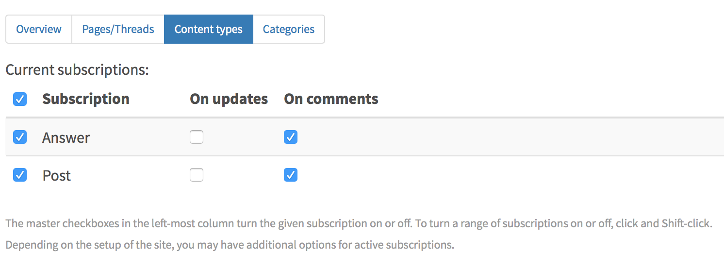
In this case, you'll get only one notification for every new article or question posted on DC and every answer and comment if you checked this option.
Here are some recipes with this option.
1. Receive all the new posts notifications (without answers and comments in it):
Turn on Post checkbox.
2.
I searched fror "documenting classes" from the search button with no filtering. it naturally came back with 559 responses, but to me, the responses (and therefore the search) came without context.
for instance, one of the texts came back with:
Answer:
In first you should define ODBC DSN in your operation system, to your Oracle DB. Then you can look at this page in the documentation and class %SQLGatewayConnection Vote up! Vote down! Rating: 0 .
Hi, Community!
We introduced new tags for the posts:
See the full list of tags.
Leave your requests for other new tags to introduce.
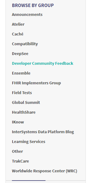
Is there a group for InterSystems IRIS? If not, can you create it?
I am logged in and cannot seem to edit my background information and some other attributes.
What gives?
Most likely I am doing something wrong but any help would be appreciated.
A lot of tools in InterSystems products are designed to help facilitate high availability solutions (Mirroring and ECP come to mind readily). Since a lot of concerns about these technologies are in a similar thread regarding High Availability, I believe it might be worthwhile to create a High Availability Group within the Developer's Community.
What thoughts do people have on the addition of such a group?
When starting a post, especially for the beginner there are a lot of buttons, check marks, icons etc. On some of them when you hover you get a very brief descriptions. In reading through some of the responses to the Developer Community Feedback there is a lot of good information.
Could one of the moderators, who know all the tricks put together a one or two page "cheat sheet?" or beginner guide?
This "Cheat Sheet" would be of great help!
I get the impression that there is a great push to encourage others to use the Developers Community.
I just noticed a new navigation item - "Back" now appears above the "Links side bar when viewing posts.
It is in the wrong font. Also it seems very odd place for this navigation item.
It alters the page layout by moving the content down & introducing more whitespace.
See image:

You may have already covered this in another place, but how does one insert "Relevant Articles?" in a post?
I am confused about the meaning of "rating".
Is it how good the post is?
I did a search on "Rating" and got a lot of hits, but none seems to answer my question, either that or I missed it.
It would be nice to have some basic documentation on questions like these.
I don't mean to be difficult and maybe I don't understand, but what is the reason for having a rating?
On the Links area:
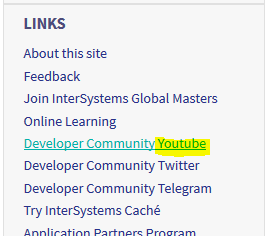
"Youtube" should read "YouTube".
I just noticed that when I view this post of mine from a browser where I'm not logged in, none of the three embedded screenshot images appear:
https://community.intersystems.com/post/why-atelier-11s-compare-servers…
Is this intentional? Or a bug?
I was trying to find an article today that I knew had been posted about Wireshark installations causing problems with Studio and other Caché components. If I search the community for 'Wireshark install', the article I'm looking for does not even show up. I found it eventually in the text of one of the Digest post, but this is the article:
How could that possible not show up for a search for 'Wireshark install'?
I know this has been requested before, but it's really annoying, especially in the Developer Community.
Here is my typical workflow:
1. Click "Developer Community" forum
2. Click "Post question".
3. Select "Developer Community" in Group dropdown.
4. Select "Developer Community" in Related Topic dropdown.
Yes, 3 out of 4 steps to post a new question here require me to select the same thing. It's frustrating. Here I go again!
I'm pretty sure that we used to be able to click on the logo at the top of the homepage in order to reload it:
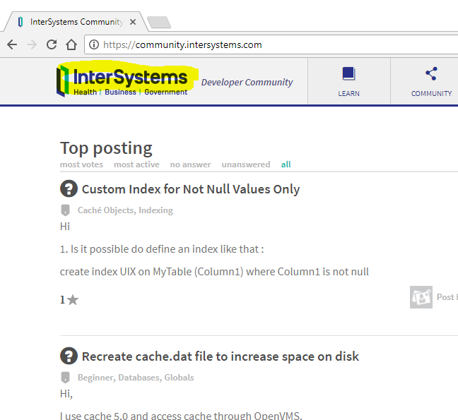
But this no longer has a hyperlink, so I have to use my browser's reload facilities.
Was this change deliberate?
When using the search field on this site, sorting by 'Relevancy' shows same results as when sorting by 'Newest first', and it seems that results are really sorted by newest first. A bug maybe?
Regards,
Jiri
Are these search filter options supposed to be exposed? They seem like they are some sort of system description that should not be exposed to the general public?
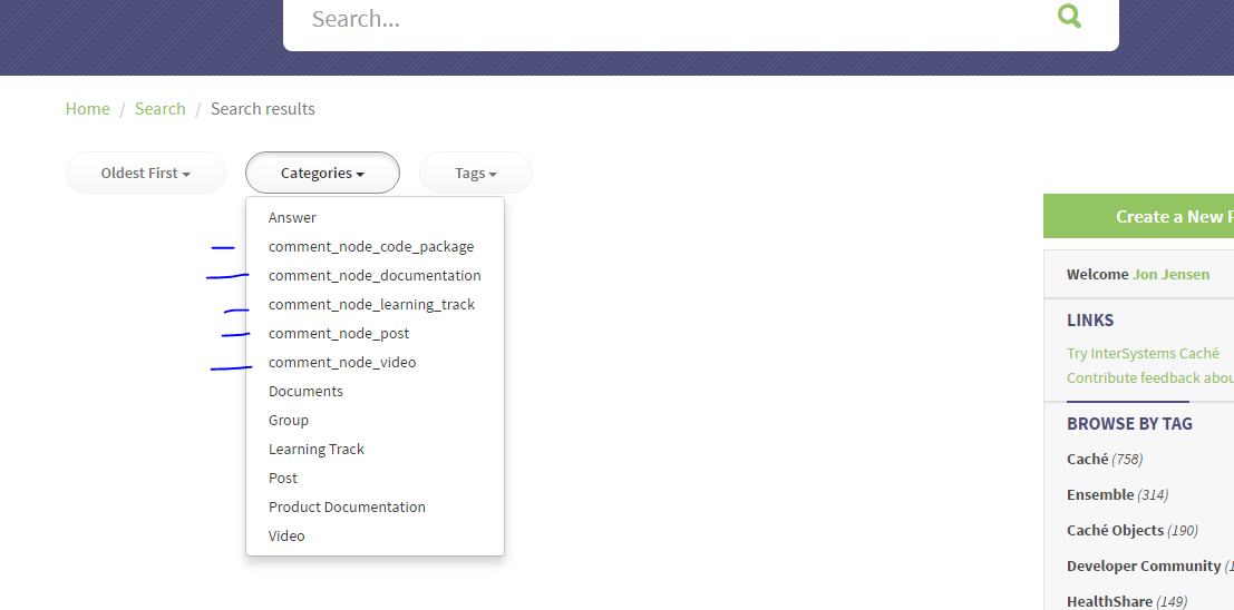
suggestions to try to make the searching of the community better, more relevent
I've been searching within the community for an article about troubleshoting SQL's working out how efficient they are, and how to look inside the system for other SLQ's that we used but may be inefficient, (still haven't found it, and getting frustrated)
In this instance, after many guesses, I tried
sql "how to" analyze plan tutorial efficiency inefficient troubleshooting highest
I know I've seen the article about this very subject, but it's getting darned hard to find things in the community.
Searching the developer community for the string "node.js" leads to navigating to the following URL: https://community.intersystems.com/search/all/node.js for which the browser receives the "404 NOT FOUND" error response. The behavior is consistent for any search string ending on ".js" or ".css" (not sure whether there any other suffixes affected). Please fix the DC to handle such search strings appropriately.
Hi, Community!
Due to increasing number of new questions and articles regarding containerization, docker, microservices we've introduced certain tags. Subscribe and use it in your postings.
If you have any ideas for new tags to be introduced, please add your ideas in comments.
