Just today I've started getting some digest emails referring to threads that don't show any recent updates.
Is anyone else experiencing the same?
DC Feedback relates to discussions on Developer Community UI, UX and performance problems and enhancements.
Just today I've started getting some digest emails referring to threads that don't show any recent updates.
Is anyone else experiencing the same?
I would really like to see (an option for) a more compact index of posts. The current index layout makes me feel like a) there's not much content on the site and b) I have to look harder to get an idea of what's going on. I feel like I'm forced to read each post instead of just glancing over a "list" of posts.
If I'd had time I would have made a couple mockups, but basically see any forum or email inbox for an example of what I think you should work towards (at least somewhere in between). The way it is it reminds me more of my Facebook feed.
I looked at the tag cloud (It looks more like a solid block since it is fully justified and sorted by size.)
https://community.intersystems.com/tagclouds/chunk/1
It is currently sorted by size (large -> small). It feels not like a traditional tag cloud. It feels harder to find what I want than a traditionally styled tag cloud.
I think it should be sorted alphabetically? and center justified?
Most tag clouds I see are sorted alphabetically allowing the font sizes to intermingle and create clarity of terms.
Here's a screenshot from the summary page, highlighting a couple of timestamps:

But when I open the article, here's what the posting reports:

And the timestamps of the two answers:

So why does the summary page report that the posting and the last answer are many hours more recent than they seem to be when I look at them?
I just recently got a mail regarding the latest and greatest.
I find the mail impossible to read or make any sense of.
At the bottom it says to manage my subscription.
I clicked on the link and it took me to a page that says I am denied.
All the time I am still logged in.
Then, can you tell me how do I manage my subscriptions and stop those impossible emails?
I sure wish we were back to the Google Group, I understood that.
Please see attached screenshot
In "My Content" and "My Collaborations" headers for answers are shown with some internal Ids.
I think it should be just name of the corresponding question.
Release Notes - 4/8/2016
Release Notes - Developer Community (External) - Version DCWeb-040816-Release
** Task
* [DCE-113] - Remove Content Type "Code Package"
* [DCE-115] - Add DC members mentioning functionality
* [DCE-116] - Fix layout on Global Summit landing page
* [DCE-118] - Tag appropriate content as "New"
* [DCE-123] - Change "Newest" filter rules
** Bug
* [DCE-114] - Adding comment to Answer should mark parent posting as updated
* [DCE-117] - Home page duplicates postings when more than one group selected
* [DCE-119] - Search results showing raw answer name
In the subscriptions e-mails I get (digested), the URLs are typically wrapped across lines, like:
| Post link:

|

|http://community.intersystems.com/post/explanation-defaultdb-database-2

|01610  Direct unsubscribe link (content type):
My mail client can't handle this, of course; the link doesn't work. (The actual link in this case is: https://community.intersystems.com/post/explanation-defaultdb-database-… )
I create a new blank post. Then I choose a group (I picked Caché). Next I click int the "Related Topics" field. At this point Firefox stops responding. It happens with FF 45.0.1 on 32-bit Windows and with 46.0.b7 on 64-bit Windows.
I'm posting this report using Chrome.
In this release we added new functionality that marks postings with either a "new" icon or an "unread" icon depending on when you came to the site last and the age of the postings.
Here are the rules as currently implemented:
- If a user hasn't viewed content which was posted less than 2 weeks ago, then the label "new" is displayed.
- If the user hasn't viewed content which was posted more than 2 weeks ago then the label "unread" is display.
I think it'd make more sense to have them in alpha order rather than as they currently are, which is sorted by their internal value:
Hey, those who created and are maintaining the Community software.
There is a lot of very good post coming in.
However, how do I either send them off to my Email or a File to save them.
I do no wish to lose some of these posts in the volume of what is coming in!
Help me Mr. Wizard!
I am sure someone knows how.
Task
[DCE-96] - Show views counter for the post
[DCE-97] - Clean up My Collaborations and My Content
[DCE-108] - Remove Find Menu
[DCE-109] - Search page - fix Categories dropdown, remove internal naming
[DCE-110] - Add warning to comments, answers and posts when page is dirty and you move off-page
[DCE-111] - Developer Synchronization: Copy global-summit-2016 view
Bug
[DCE-93] - Post author and date messaging is wrong on Post Detail Page
[DCE-112] - Improve Tag Selection - Handle Special Characters
I was putting in a comment, then clicked on a profile to check a fact, and when I came back my previously entered comments were gone!
Is there a clean way to email the contents of a post to myself?
Other than an ugly cut and paste?
Here are the release notes for the release planned for Friday, March 25th.
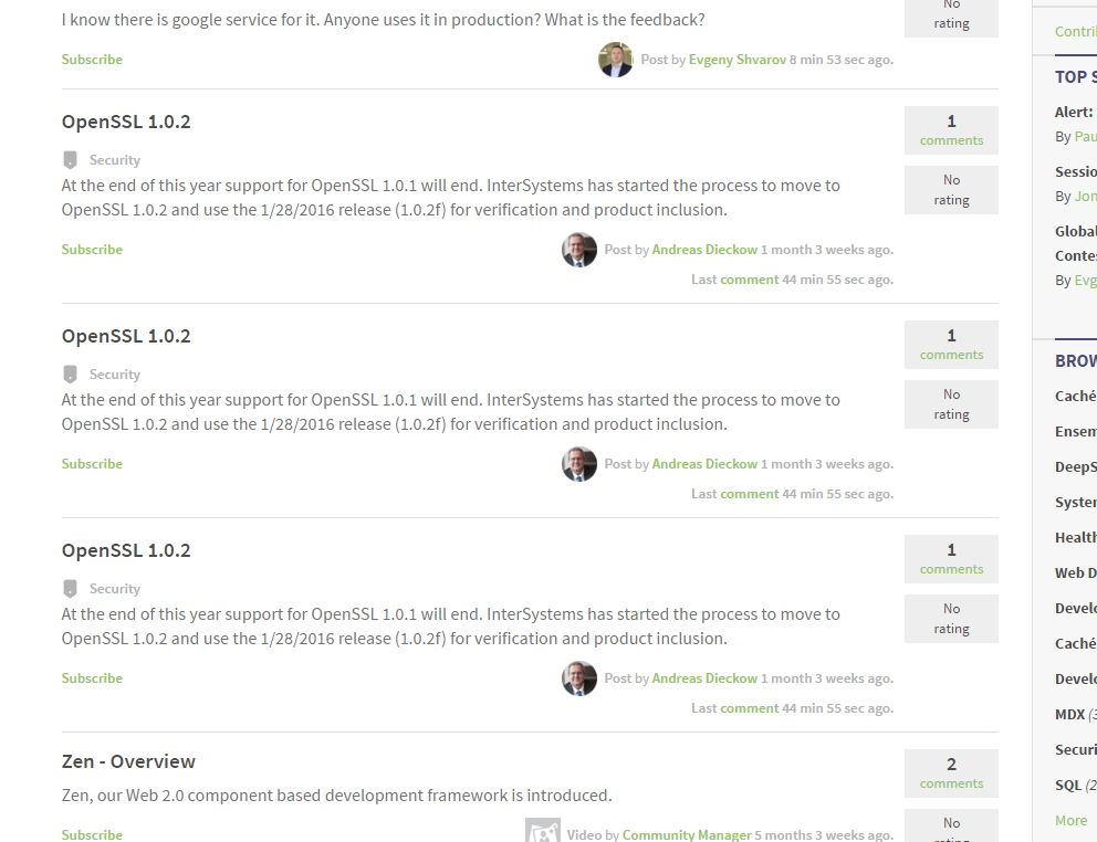
It looks like andreas posting is in triplicate - I am sure the bureaucrats are very happy - on the homepage
Not sure why...? Is there really 3 unique posts IDs that are the same or is there a bug in the hoempage display logic that is repeating the items listed?
Here's the screenshot of the sidebar widget "Related conversations":
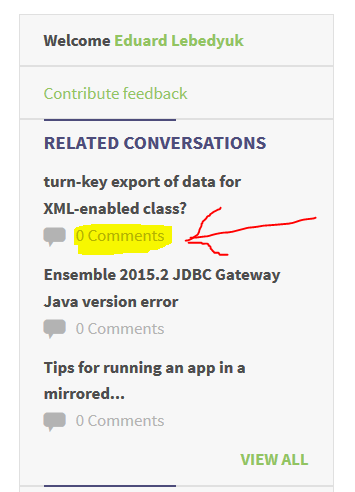
The question turn-key export of data for XML-enabled class currently has 2 answers, 0 comments for the post and 1 comment for an answer. I think it would be more informative to display one of these metrics in the widget:
Instead of the current value of number of comments for post.
In the screenshot below the left is Chrome, the right IE11 (with About box info showing).
In both cases I'm not logged in to DC, but I don't think that's relevant:

Here's something I find a bit awkward. Suppose I'm reading the posts in a group, e.g from https://community.intersystems.com/group/developer-community-feedback
I see an interesting post, so I click into it.
I add a comment to the post.
Now I want to go back to the list of posts in the group, i.e. to https://community.intersystems.com/group/developer-community-feedback but I don't see a link that takes me there. I have to resort to several clicks on the browser back button.
Perhaps it'd help if somewhere on a post's header you gave us the name of the group owning the post.
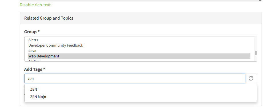
We can change to this mode of UI in the Create New Post that I think makes the tag usage easier. There's help text under the window in this screen shot and it will contain instructions on the use of tagging, the benefits and also a link to a standing post to request new tags. I think this method of operation will allow us to add many more tags without making them burdensome to navigate.
Thoughts?
Not quite sure how to connect groups to tags in this UI but that might be the next step.
I received an email notification and the only link was directly to the comment: https://community.intersystems.com/question406316/answer406331
From that page you can see that there is no way to get to the full question itself (unless I'm missing it).
Looking through my subscriptions it looks like I'm literally subscribed to the answer and not the main topic.

it's so good it's repeating. Not sure why. Investigating.
Here's the scenario. I write a post, click the Publish button to post it, but overlook the fact that because I didn't add a tag I'm still on the same page. The pink area highlighting what I forgot to fill in is out of sight at the bottom of the page. I carelessly navigate away (e.g. back button, or DC app tabs). There's no warning, and I've lost what I wrote.
Hi, Community!
The Second InterSystems Global Summit Contest finished yesterday, and we have a new winner!
John Murray has won the prize and showed very impressive contribution activity with the result:
Congratulations!
John gets Free Registration on InterSystems Global Summit 2016 and the 4-night stay in Arizona Biltmore, Waldorf Astoria Resort!
Thanks everyone who participated in this contest!
I think there should at the very least be a third option; "discussion".
Was this intentional? I don't like it.
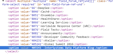
How about a default tag for each community? If I'm in the Developer Community Feedback I shouldn't have to also pick a related topic of Developer Community.
This post brought to you by the department of redundancy department.