Today DC supports the notifications for the posts' updates. It means if someone changes the post text, title, group or tag you can be notified about that.
But this notifications just inform that there were updates, but do not show what exactly was changed in the post.
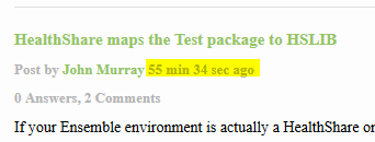
So through this, you can get the notifications for the posts from previous years without any reason what's happened.
I would suggest to turn off this types of notifications until we'll implement the details in notifications, what exactly was changed in the post and why did you get it.
How do we get posts featured/sticky/always on the top of the homepage?
We need the ability to have a couple posts always on the homepage. Most sites have some sort of Featured/Announcement/Sticky function for important information to be seen by all.
I had typed up a large reply and then learned something new so I intended to hit CTRL+A to select everything and delete it. Can't do that. Apparently CTRL+A, like backspace, causes the input field to lose focus.
My recent Ensemble posting here contains a wink emoji in its first sentence, but when rendered on the DC homepage summary list it shows as the text "wink".
I clicked on my name to view my profile. It shows a list of recently read posts. This list is incorrect. It seems to be listing all the posts on the homepage as post I have read. I have not read the majority of these posts.
Perhaps the recently read logic is broken? I assume recently read would require me to actually view the posting to consider it read?
Can you correct (or remove) this information in the profiles
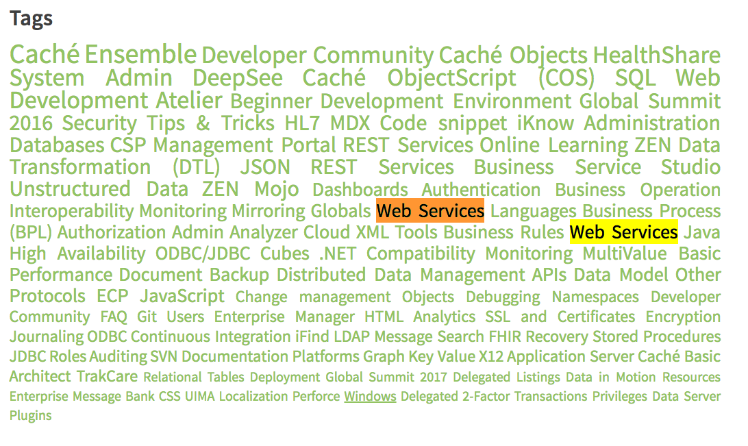
It should be sorted alphabetically, not by popularity. Displaying the cloud alphabetically allows the font sizes to intermingle and create a more readable tag cloud.
Also center justify the cloud to ensure consistent spacing between letters and words (full justification creates unusual spacing)
I used the Members option from the Community button to look up Evgeny's profile. Above the tabs ("View", "Mentions", "Posts (53)" etc) his name was displayed (correct).
Then I clicked on the "Posts (53)" tab. It showed his posts, but displayed my name above the tabs.
Please update the Global Summit group description.
Current/old: InterSystems Global Summit 2016 is an unparalleled opportunity to meet with your peers and with InterSystems’ executives and experts, discussing the technologies, strategies, and methodologies that lead to success.This group is intened to discuss news and to ask questions about Global Summit 2016 conferences, unconferences, sessions etc.Register now!
 By date