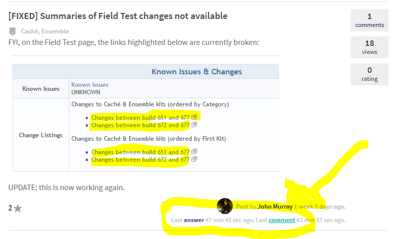
Article
· Apr 14, 2016 1m read
[request] a more compact index

I would really like to see (an option for) a more compact index of posts. The current index layout makes me feel like a) there's not much content on the site and b) I have to look harder to get an idea of what's going on. I feel like I'm forced to read each post instead of just glancing over a "list" of posts.

1 3
0 188

A lot of tools in InterSystems products are designed to help facilitate high availability solutions (Mirroring and ECP come to mind readily). Since a lot of concerns about these technologies are in a similar thread regarding High Availability, I believe it might be worthwhile to create a High Availability Group within the Developer's Community.

What thoughts do people have on the addition of such a group?

1 1
0 228
Article
· Feb 10, 2016
Responsive Design broken

Hi! I know that we have a layout for mobile devices, but it's broken on the pages with code snippets and another unfixed width content. Screenshots are attached.

I found that overflow property has 'auto' value, but the width (and max-width) property doesn't set for <pre>. Could you set max-width property for pre and other elements?

For example, these modified styles work fine for me on any screens for <pre> and <img> (with your media queries):

1 4
0 275
Article
· Mar 17, 2016 1m read
Congrats!

This latest update was a huge stride in making the community usable. I think you fixed almost all of the major usage gripes I had and it's looking great!

1 0
0 94

Since it took me a while to find the correct place to reply to a specific comment and not the post itself, I thought I'd make this observation an 'improvement request'.

Currently a comment has only the small grey arrow at the bottom, next to the 'favorite' button. The 'favorite' button has color and text which make it way more prominent. The 'reply' button on the other hand is gray and has no text. It's easy to miss.

I suggest adding at least text and perhaps also some color to the 'reply' button to make it stand out more. Even a tooltip would be useful.

1 4
0 223

Looking at the navigation, should we consider moving the Logout function under the My Account button? It is kind of oldschool to see the logout functionality as a stand alone menu item.

Maybe the My Account button should have "Account Settings" and "Logout" as the drop menu items?

Thoughts?

1 1
0 160

As well as participating in DC I continue to monitor the Google Group at https://groups.google.com/forum/#!forum/intersystems-public-cache

Since yesterday the Google Group has started receiving postings from a user called intersystems.dc. These postings look like they're trying to replicate DC postings, though images don't appear. Nor are there any links leading across to DC, which is where the follow-up comments and answers are likely to appear.

1 4
0 242

suggestions to try to make the searching of the community better, more relevent

I've been searching within the community for an article about troubleshoting SQL's working out how efficient they are, and how to look inside the system for other SLQ's that we used but may be inefficient, (still haven't found it, and getting frustrated)

In this instance, after many guesses, I tried

1 3
0 236
Article
· Jan 19, 2016
Announcements on homepage?

Should items in the announcement group be shown on the homepage?

It would seem if there was an announcement (like the field test or Global Summit) it show up some where on everyones home page.

1 1
0 64