Visualizing the data jungle -- Part I. Let's make a graph
This is the first article of a series diving into visualization tools and analysis of time series data. Obviously we are most interested in looking at performance related data we can gather from the Caché family of products. However, as we'll see down the road, we are absolutely not limited to that. For now we are exploring python and the libraries/tools available within that ecosystem.
The series is closely tying into Murray's excellent series about Caché performance and monitoring (see here) and more specifically this article.
Disclaimer I: While I will be talking in passing about the interpretation of the data we are looking at, talking about that in detail would distract too much from actual goal. I highly recommend Murray's series as a start, to get a basic understanding of the subject matter.
Disclaimer II: There are gazillion tools out there that allow you to do visualization of the collected data. Many of them work either directly with the data you get out of mgstat and friends, or only need minimal adjustment. This is by no means a 'this solution is the best'-post. It is just one way I've found helpful and efficient to work with the data.
Disclaimer III: Data visualization and analysis is a highly addictive, exciting, and fun field to dive into. You might loose some free time over this. You have been warned!
So without further ado, let's dive into it.
Prerequisites
To get started, you will need some tools and libraries:
- Jupyter notebooks
- Python (3)
- various Python libraries we will be using down the road
Python (3) You will need Python on your machine. There are numerous ways to install it on various architectures. I use homebrew on my mac, which made it easy:
brew install python3
Ask google for instructions for your favourite platform.
Jupyter notebooks: While not technically necessary, Jupyter notebooks make working on python scripts a breeze. It allows you to interactively run and display python scripts from a browser window. It also allows collaborative working on scripts. Since it makes it really easy to experiment and play with code, it's highly recommended.
pip3 install jupyter
(again, talk to $search-engine ;)
Python libraries I'll mentioned the different python libraries while we're using them down the road. If you're getting an error on an import statement, a good first guess is always to make sure you have the library installed:
pip3 install matplotlib
Getting started
Assuming you have everything installed on your machine, you should be able to run
jupyter notebook
from a directory.
This should automatically pull up a browser window with a simple UI.
We'll go ahead and create a new notebook through the menu and add a couple of import statement to our first code-cell (New -> Notebooks -> Python3):
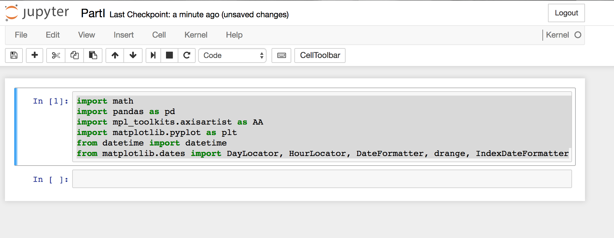
import math
import pandas as pd
import mpl_toolkits.axisartist as AA
from mpl_toolkits.axes_grid1 import host_subplot
import matplotlib.pyplot as plt
from datetime import datetime
from matplotlib.dates import DateFormatter
As for the libraries we are importing I just want to mention a few:
- Pandas "is an open source, BSD-licensed library providing high-performance, easy-to-use data structures and data analysis tools for the Python programming language." Which allows as to work efficiently with big data sets. While the datasets we get out of pButtons, are by no means 'big data'. We will however, take solace in the fact that we could look at a lot of data at once. Imagine you had been collecting pButtons with 24h/2second sampling for the last 20 years on your system. We could graph that.
- Matplotlib "matplotlib is a python 2D plotting library which produces publication quality figures in a variety of hardcopy formats and interactive environments across platforms." This will be the main graphing engine we are going to use (for now).
If you are getting an error running the current code cell (shortcut: Ctrl+Enter) (list of shortcuts), be sure to check that you have them installed.
You will also notice that I renamed the Untitled notebook, to do so, you can simply click on the title.
Loading some data
Now that we layed some ground work, it is time to pull in some data. Luckily Pandas provides an easy way to load CSV data. Since we happen to have a set of mgstat data lying around in csv-format, we'll just use that.
mgstatfile = '/Users/kazamatzuri/work/proj/vis-articles/part1/mgstat.txt'
data = pd.read_csv(
    mgstatfile,
    header=1,
    parse_dates=[[0,1]]
   )
We are utilizing the read_csv command to directly read the mgstat data into a DataFrame. Check out the full documentation for a comprehensive overview of the options. In short: we are simply passing in the file to read and tell it that the second line (0 based!) contains the header names. Since mgstat splits up the date and time fields into two fields, we also need have those combined with the parse_dates parameter.
data.info()
RangeIndex: 25635 entries, 0 to 25634
Data columns (total 37 columns):
Date_       Time        25635 non-null datetime64[ns]
  Glorefs               25635 non-null int64
 RemGrefs               25635 non-null int64
 GRratio                25635 non-null int64
  PhyRds                25635 non-null int64
 Rdratio                25635 non-null float64
 Gloupds                25635 non-null int64
 RemGupds               25635 non-null int64
 Rourefs                25635 non-null int64
 RemRrefs               25635 non-null int64
  RouLaS                25635 non-null int64
 RemRLaS                25635 non-null int64
  PhyWrs                25635 non-null int64
   WDQsz                25635 non-null int64
  WDtmpq                25635 non-null int64
 WDphase                25635 non-null int64
  WIJwri                25635 non-null int64
  RouCMs                25635 non-null int64
 Jrnwrts                25635 non-null int64
   GblSz                25635 non-null int64
 pGblNsz                25635 non-null int64
 pGblAsz                25635 non-null float64
   ObjSz                25635 non-null int64
 pObjNsz                25635 non-null int64
 pObjAsz                25635 non-null int64
   BDBSz                25635 non-null int64
 pBDBNsz                25635 non-null int64
 pBDBAsz                25635 non-null float64
  ActECP                25635 non-null int64
  Addblk                25635 non-null int64
 PrgBufL                25635 non-null int64
 PrgSrvR                25635 non-null int64
  BytSnt                25635 non-null int64
  BytRcd                25635 non-null int64
  WDpass                25635 non-null int64
  IJUcnt                25635 non-null int64
 IJULock                25635 non-null int64
dtypes: datetime64[ns](1), float64(3), int64(33)
memory usage: 7.2 MB
gives us a nice overview of the DataFrame collected.
Working with the data
Since some the fieldnames contain spaces and "Date_ Time" is rather unwieldy, we'll go ahead and strip the strings and rename the first column:
data.columns=data.columns.str.strip()
data=data.rename(columns={'Date_       Time':'DateTime'})
The DataFrame defaults to a RangeIndex. This isn't very useful to look at our data. Since we have a rather practical DateTime column available, we'll go ahead and set that as index:
data.index=data.DateTime
Now we are ready to create an initial version of our plot. Since this is always one of the first things to look at, let's use Glorefs for this:
plt.figure(num=None, figsize=(16,5), dpi=80, facecolor='w', edgecolor='k')
plt.xticks(rotation=70)
plt.plot(data.DateTime,data.Glorefs)
plt.show()
First we tell the library which size we want the graph in. We also want the x-axis lables to be rotated a bit, so they don't overlap. Finally we plot DateTime vs Glorefs and show the graph. This gives us something like the following graph.
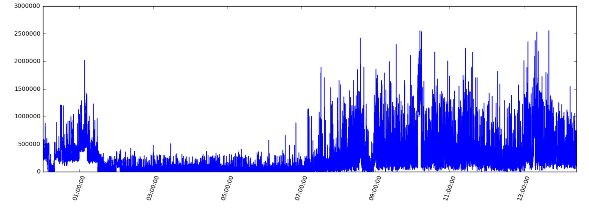
We can easily replace Glorefs with any of the other columns to get a general idea of what is going on.
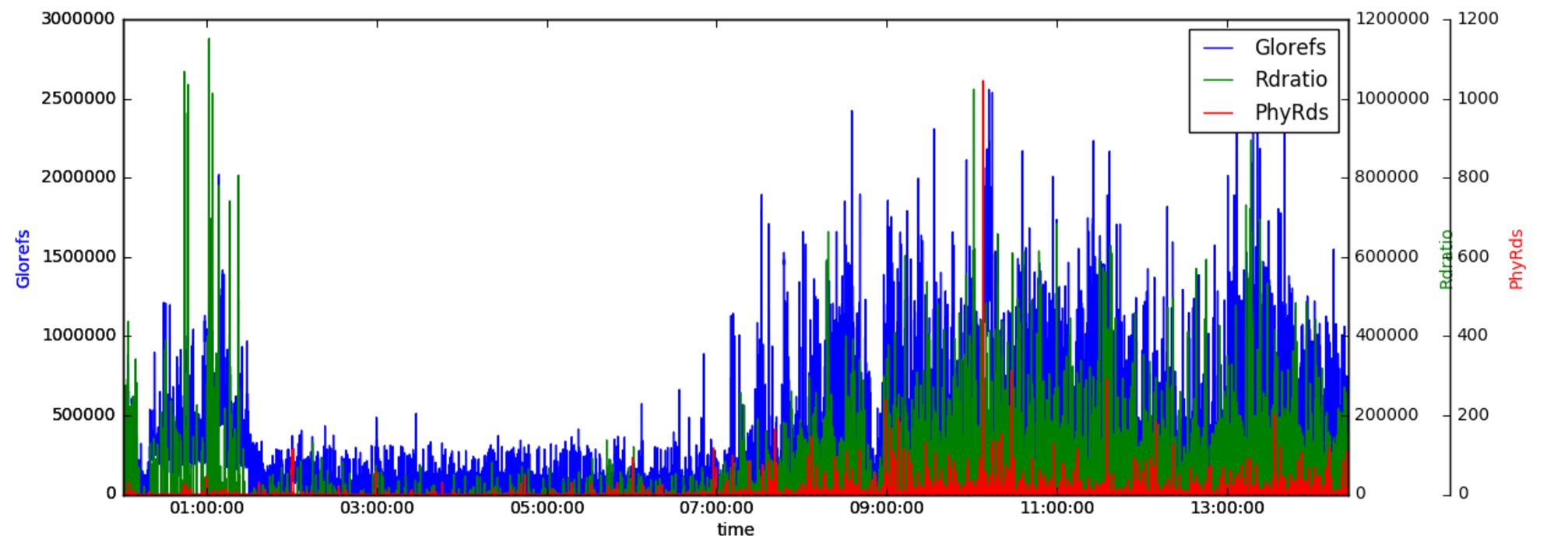
Combining graphs
Sometime is is quite helpful to look at multiple graphs at once. So the idea to draw multiple plots into one graph seems natural. While it is very straightforward to do that with matplotlib alone:
plt.plot(data.DateTime,data.Glorefs)
plt.plot(data.DateTime,data.PhyRds)
plt.show()
This will give us pretty much the same graph as before. The problem of course being the y-scale. Since Glorefs goes up into the millions, while PhyRds are usually in the 100s (to thousands), we don't see those.
To solve this we'll need to use the previously imported axisartist toolkit.
plt.gcf()
plt.figure(num=None, figsize=(16,5), dpi=80, facecolor='w', edgecolor='k')
host = host_subplot(111, axes_class=AA.Axes)
plt.subplots_adjust(right=0.75)

par1 = host.twinx()
par2 = host.twinx()
offset = 60
new_fixed_axis = par2.get_grid_helper().new_fixed_axis
par2.axis["right"] = new_fixed_axis(loc="right",axes=par2,offset=(offset, 0))
par2.axis["right"].toggle(all=True)

host.set_xlabel("time")
host.set_ylabel("Glorefs")
par1.set_ylabel("Rdratio")
par2.set_ylabel("PhyRds")

p1,=host.plot(data.Glorefs,label="Glorefs")
p2,=par1.plot(data.Rdratio,label="Rdratio")
p3,=par2.plot(data.PhyRds,label="PhyRds")

host.legend()

host.axis["left"].label.set_color(p1.get_color())
par1.axis["right"].label.set_color(p2.get_color())
par2.axis["right"].label.set_color(p3.get_color())

plt.draw()
plt.show()
The short summary is: we'll add two y-axis to the plot, which will have their own scaling. While we implicetely used the subplot in our first example, in this case we need to access it directly to be able to add the axis and labels. We set a couple of labels and the colors. After adding a legend and connecting the colors to the different plots we end up with an image like this:
Final comments
This already gives us a couple of very powerful tools to plot our data. We explored how to load mgstat data and create some basic plots. In the next part, we will play with different output formats for our graphs and pull in some more data.
Comments and questions are encouraged! Share your experiences!
-Fab
ps. the notebook for this is available here
Comments
Very Cool! Better than my dodgy old perl scripts and gnuplot ;)
Just a couple of hints for others like me who bumbled through some of the installation steps (On MacOS Sierra, 10.12.2).
I needed to use sudo i.e. run sudo pip install matplotlib and sudo pip install pandas
I also used Anaconda to install and run jupyter notebook
Hi,
Great tool, just for nostalgic ones, just by replacing
os.makedirs('./' + FILEPREFIX + 'charts', exist_ok=True)
to
if (not os.path.exists('./' + FILEPREFIX + 'charts/vmstat')):
                                    os.makedirs('./' + FILEPREFIX + 'charts/vmstat')
And the code will work with Python 2 (Tested in my Fedora 25 box with Python 2.7).
Cheers
Awesome, thanks!
Great post. I am looking forward to part 2.