Let's write an Angular 1.x app with a Caché REST backend - Part 11
In our last lesson, we added a form to Edit our existing Widgets, and save them back to the server. However, our Form was not well structured and our Save button had no intelligence, and was not fully visible. So today, we will apply some Material components and Angular style to make the form more useful
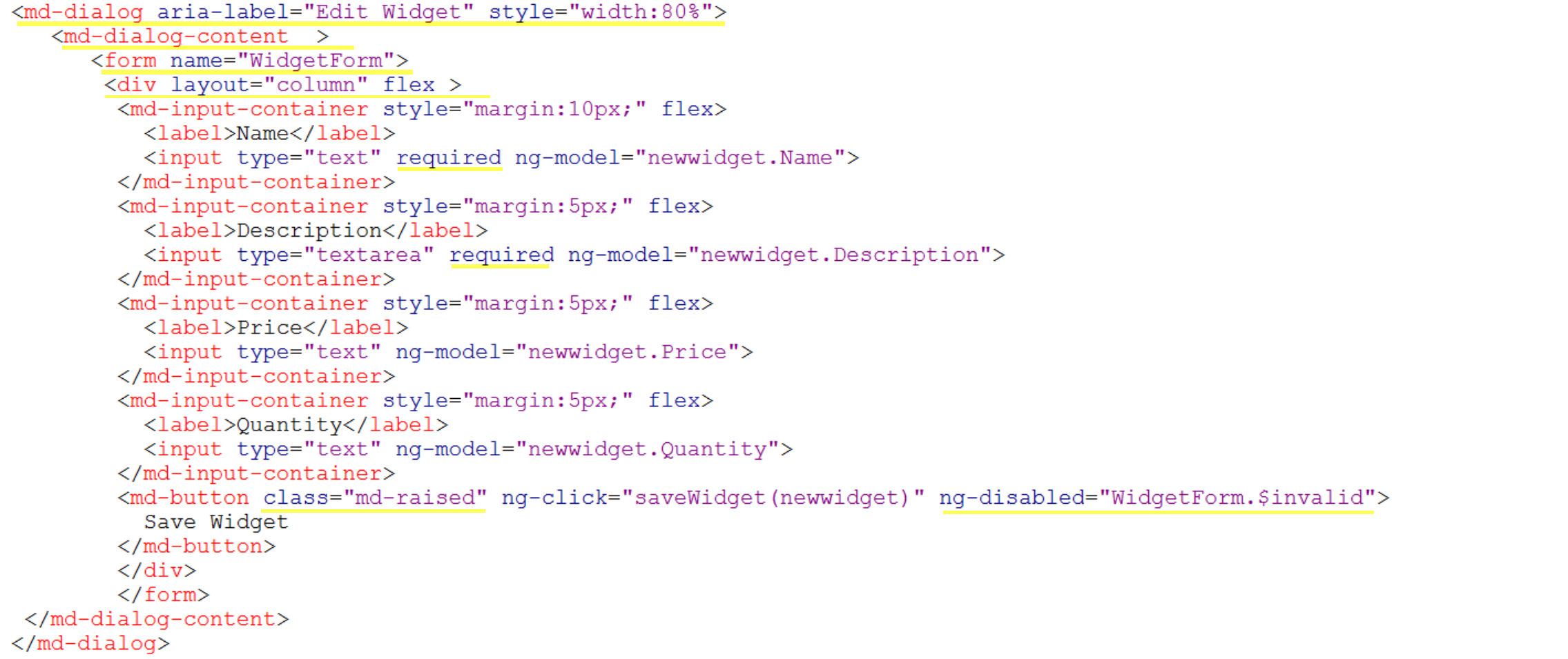
Let's open EditWidget.csp, and make some changes. First, we want to change the component from an md-card to an md-dialog. We then want to wrap the content in a div so we can set the layout to "column" so the controls display in a vertical list, and also a Form which enables Angular to verify the state of the form.
Next we will mark the Name and Description as required, which can set the $valid and $invalid states of the form. We can then use this to control the disabling of the Save button, which we will apply an md-raised style to. Let's take a look at the code, with the changes highlighted

How does this look now? We now have a well structured form, and if we remove one of our Required fields, our Save button disables and we can't save the Widget until we reinstate the mandatory data. We also get a visible marker of the fields which are marked as mandatory.


The form still looks a little bare though, so we can add a Toolbar to show the operation and basic information of the selected Widget

And now, we have a better looking form

Today we:
- Changed our form to an md-dialog
- Used the layout directive to control the flow of the page
- Added form validation and used to control the Save button
- Added a toolbar to the form
Next time we will:
- experience some shake ups at Widgets Direct
This article is part of a multi-part series on using Angular on top of Caché REST services. The listing of the full series can be found at the Start Here page