Map Visualization of Presidential Elections in Russia 2018
Introduction
Any election is a highly mysterious process, and when you look at its results, the overall picture is not quite clear. I decided to put them, region by region, on the map of Moscow using InterSystems technologies that offer both storage and data analysis functionality. In this particular case, I used InterSystems Ensemble, a platform for application development and integration, but you can also build this solution using the multi-model InterSystems Caché DBMS, as well as InterSystems’ new product called IRIS Data Platform.
Stages:
We will do the following to visualize the map:
- Collect the election data to be shown on the map;
- Convert the collected data into the necessary format;
- Create persistent classes and populate them;
- Create an OLAP cube;
- Create a pivot (or several ones);
- Create and set up a dashboard;
- Install MDX2JSON and DeepSeeWeb projects;
- Collect polygon coordinates;
- Create termlists and add control elements.
Data collection
In order to display the results of the presidential election, we need a data model. Let’s create the following classes:
- map.MoscowElections2018 — a class containing election results
- map.MoscowRegion — a reference table of Moscow’s regions that objects of the map.MoscowElections2018 class will refer to
Let’s start by creating the map.MoscowRegion class.
I simply went to Wikipedia to collect data about districts and administrative divisions and created an XML-enabled class for it.
Now, let’s convert the received data into the XML format
For election results, I went to the website of the Central Election Commission of the Russian Federation. Unfortunately, they didn’t have an API that I could use to fetch the necessary data, so I ended up copying the results from the official summary table. You can use filters to get the results of other elections, not just the presidential one – for example, the State Duma election and elections of regional heads across the country. Since we are interested in the presidential election, we just find the right summary table for Moscow, download it, transform it into the necessary format (we chose XML for our example, since this format can be easily imported into our InterSystems database).
As the result, we get something along these lines:
Election data in the XML format
I created an XML-enabled class map.MoscowElections2018 for the data on the InterSystems platform:
Code of the map.MoscowElections2018 class
Creating a cube
To create an OLAP cube, we use the DeepSee Architect web application. To start it, let’s open the System Management Portal, then go to DeepSee → Namespace selection → Architect.
In case you don’t see your namespace in the list of namespaces accessible to DeepSee, go to System Management Portal → System administration → Security → Applications → Web applications → /csp/<your namespace>, then check the “DeepSee” option in the “Enabled” field, then click the Save button. After that, the selected namespace should appear on the list of namespaces available to DeepSee.
Let’s click the “Create” button to open the new cube creation screen. We need to specify the following parameters:
- Cube name — the name of the cube to be used for addressing it
- Display name — localizable name of the cube (translation is performed using standard means available in InterSystems)
- Cube source — use a facts table or another cube as a data source
- Source class — if a class was selected on the previous step, we need to specify the map.MoscowElections2018 class as the facts table.
- Class name for the cube — the name of the class that will store the cube’s definition. Created automatically.
- Class description — an arbitrary description
Our new cube:

Defining the cube’s properties.
A new cube will be created after the OK button is pressed.
On the left, you can see the properties of the base class and the ones that are associated with it via the “snowflake” and that can be used for building a cube.
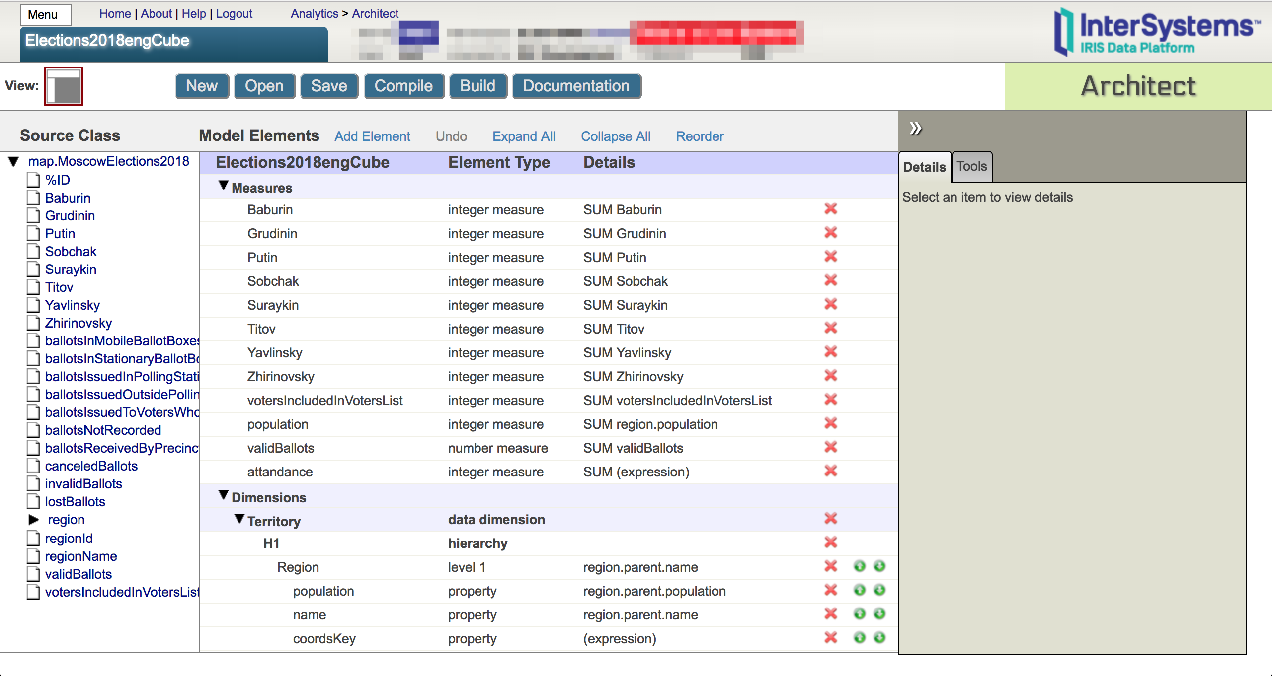
The central part of the screen is the cube’s skeleton. It can be filled with class properties by dragging and dropping them from the base class’s space or by adding elements manually. The key elements of a cube are dimensions, measures and lists.
Dimensions
Dimensions are cube elements that group the records of the facts table. As a rule, dimensions are the “quality” attributes of the base class that break the records of the facts table into groups by certain criteria.
For example, we’d like to group all facts by municipal education and then by region as we drill down.
To group facts by regions, we can use a wonderful property called Territory. Since our hierarchy starts with municipal education, the first level should contain the dimension of the region’s parent. That is, we need to click a small arrow next to the “region” property in the left list, then unfold the “parent” property in the new list, then drag and drop “name” into the dimensions area — as the result, the Architect will add to the cube a dimension called “name” with a single hierarchy H1 and a single level “name”. For convenience, let’s rename the dimension from “name” to Territory and its first level to Region.
Apart from grouping, dimensions let you build fact nesting hierarchies using a top-to-bottom approach. To do that, let’s add a Subregion level by dragging the name of the region into the H1 hierarchy, add a population property and a name to both dimensions, as well as the yet mysterious coordsKey property with the value of the dimension’s name — this property will be used for searching for the coordinates of the polygon corresponding to this municipal unit/region and highlighting it on the map. Let’s specify the display names in dimension and level signatures.
Measures
Measures or metrics are elements of the cube that store “quantitative” data that need to be calculated for “qualitative” cube dimensions.
For example, the following properties can be such dimensions in the facts table:
- population,
- validBallots (number of valid ballots),
- votersIncludedInVotersList (number of voters),
- specific values for each of the eight candidates
- Baburin SN,
- Grudinin PN,
- Putin VV,
- Sobchak KA,
- Suraykin MA,
- Titov BY,
- Yavlinsky GA,
- Zhirinovsky VV.
Let’s now drag each property onto the dimensions area and create a numerical value of the Integer type with the SUM function that will calculate the number of votes in the current data slice. Also, let’s specify the display name for each measure.
Compiling the cube
All right, we’ve added eight measures to the cube – quite enough to take a look at the result.
Now, we compile the cube class (using the “Compile” button). If there are no compilation errors, it means that the cube was created correctly and can be filled with data.
To do that, click on “Build a cube” – as the result, DeepSee will download data from the facts table to the cube’s data storage.
In order to work with the cube’s data, we will need another web application — DeepSee Analyzer.
Building a pivot
DeepSee Analyzer is a visual tool for the direct analysis of cube data and preparing data sources for further visualization. To switch to DeepSee Analyzer, let's open the Portal Management System → DeepSee → Namespace selection → Analyzer. You can also get there from the cube creation page by clicking on the “Tools” tab on the left panel, then on the “Analyzer” button. The Analyzer main window will open.
In the analyzer window on the left, we see the elements of the created cube: measures and dimensions. We can combine them to create queries for the cube using the MDX language – an equivalent of SQL for multi-dimensional OLAP cubes.
To create a pivot, let's drag the following measures to the columns field: Baburin SN, Grudinin PN, Putin VV, Sobchak KA, Suraykin SN, Grudinin PN, Putin VV, Sobchak KA, Suraykin MA, Titov BY, Yavlinsky GA, Zhirinovsky VV. Let “Administrative division” be our measure. We will get a table containing the number of votes per administrative division with a DrillDown option for regions.
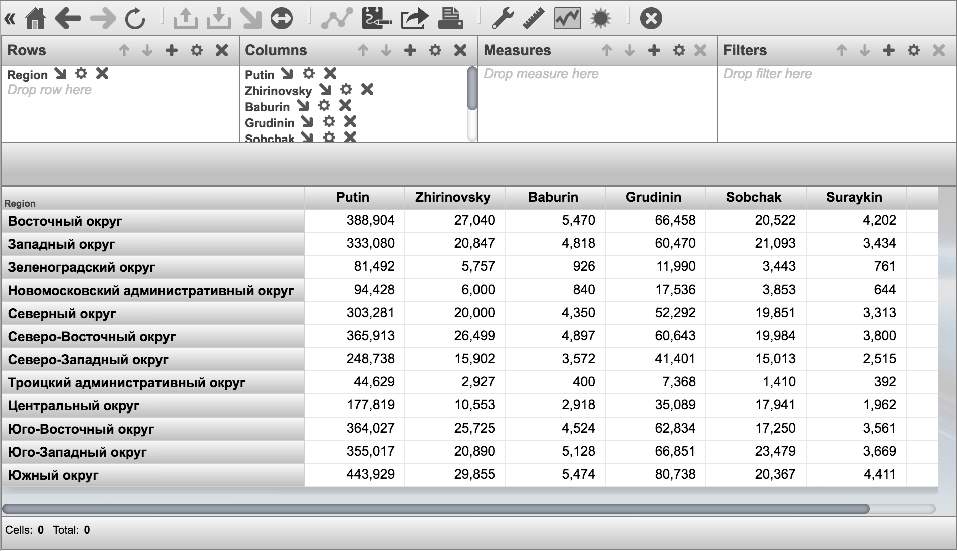
When you are working with the Analyzer, double-clicking on a measure heading takes you to the underlying measure (DrillDown). In this case, double-clicking on an administrative division will take you to its regions. As the result, you will be able to see the number of votes per region.
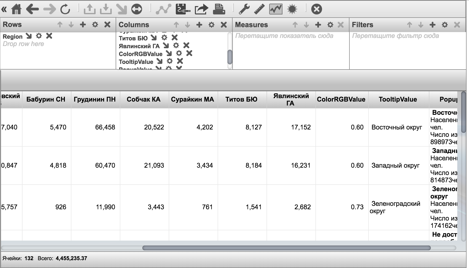
In order to highlight specific districts/regions, we need a value that will be used for coloring corresponding polygons — this value will be taken from the special ColorHSLValue column (you can find a link to an instruction for configuring map-based widgets at the end of the article). The higher the value, the closer the resulting color will be to red. Conversely, the lower the value, the closer it will be to green. To show the name of a polygon when the cursor is pointing at it, we'll use the special name of the TooltipValue column. For text that is shown in a popup window when a polygon is clicked, use the name PopupValue measure. You can use HTML for better formatting.
We will create these special fields as calculable values. To do that, click the calculator button in the left menu  , choose the element type, the names of the measure and element, as well as an expression that will be used for calculating the value of this element.
List of special fields for maps
ColorHSLValue:
- Element type: Measure
- Element name: ColorHSLValue
- Type: Number
- Description: defines the color of a polygon in the range of green to red depending on the value.
- Expression:
[Measures].[attandance]/[Measures].[votersIncludedInVotersList]
It’s a ratio of the number of voters who showed up at the polls to the total number of voters in this district/region, so the higher this ratio, the closer the color is to red.
PopupValue:
- Element type: Measure
- Measure name: custom
- Element name: PopupValue
- Type: String
- Description: defines the color of a polygon in the range of green to red depending on the value.
- Expression:
"<b>" + [Territory].[H1].[Region].CurrentMember.Properties("name") + "</b><br/>Population: " + [Measures].[Population] + " ppl.<br/>Number of voters: " + [Measures].[votersIncludedInVotersList] + "ppl."
Will output the name of this district/region, population, number of voters
TooltipValue:
- Element type: Measure
- Measure name: custom
- Element name: TooltipValue
- Type: String
- Description: Defines the message that is shown up when you place the cursor over a polygon.
- Expression:
[Territory].[H1].[Region].CurrentMember.Properties("name")
Let’s save this pivot as MoscowElections/mainPivot2018.
We will also create another pivot with information on all candidates for showing it as a pie chart.
Let's move the measures of all candidates to the “Measures” column and select the following option in measure parameters : “Place measures on” – “Rows”

Let's save the resulting pivot as MoscowElections/countPivot2018 and proceed to the creation of our dashboard
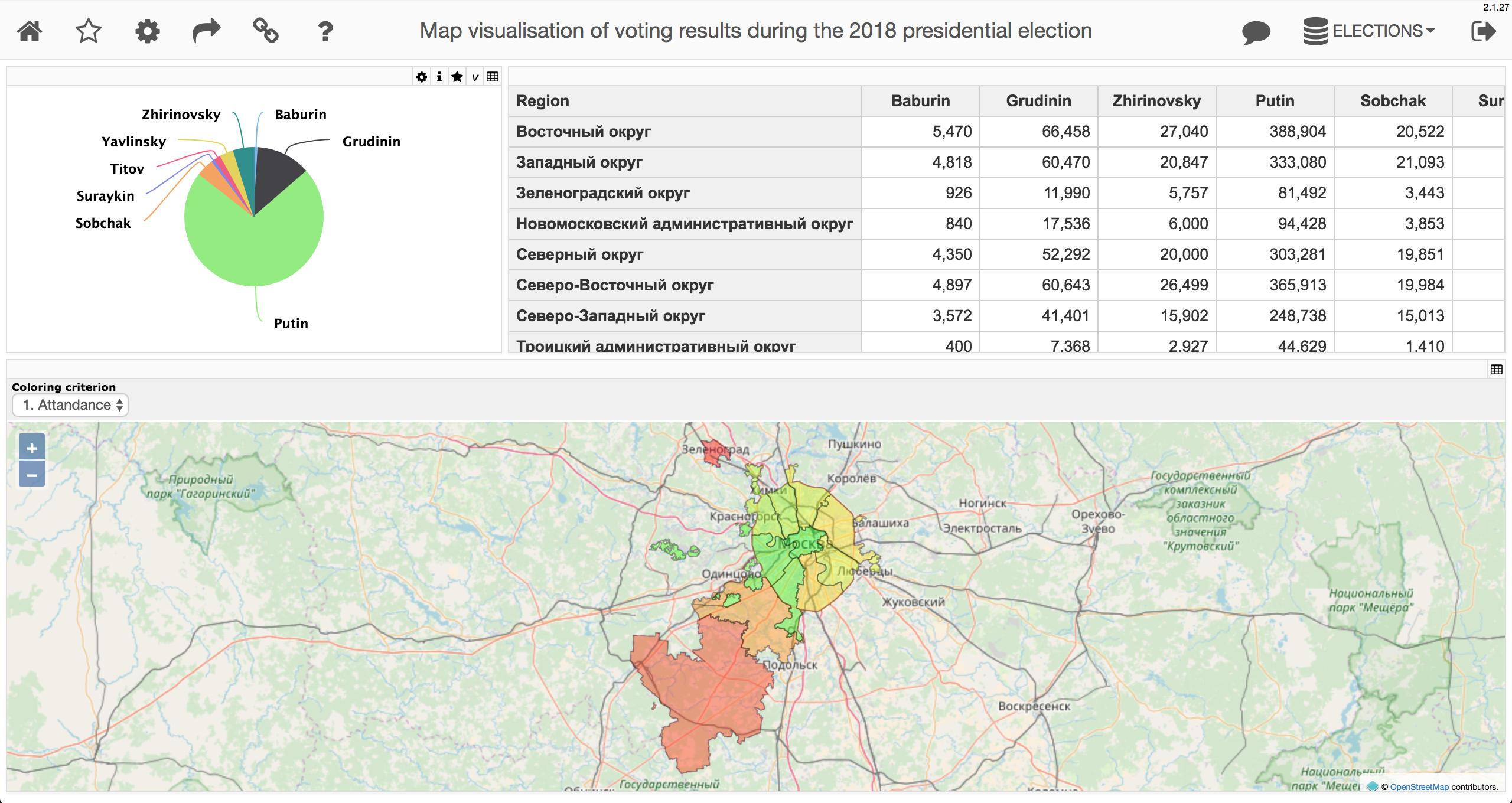
Creating a dashboard
The User Portal is a web application for creating and using dashboards. Dashboards contain widgets: tables, charts and maps based on summary tables created by analysts in Analyzer.
To switch to the DeepSee System Management Portal → DeepSee → Area selection → User Portal.
Let's create a new dashboard by clicking on the arrow on the right -> Add -> Add a dashboard.
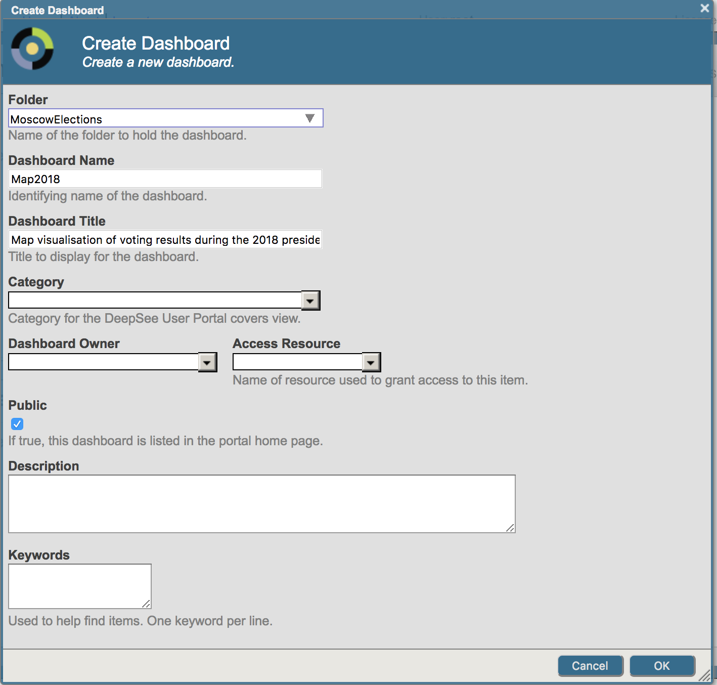
Let’s create three widgets.
To create them, let's click on the arrow on the right → Widgets → "+" → select the widget type in the left list → data source and widget name:
A map widget:
- Widget type — Map → Map
- Data source — MoscowElections/mainPivot2018
- Widget name — moscowElectionsMap
A table widget with map data:
- Widget type — Pivots and Charts → Table
- Link to — moscowElectionsMap
- Widget name — tableWidget
A pie-chart widget with candidates’ data:
- Widget type — Pivots and Charts → Line chart
- Data source — MoscowElections/countPivot2018
For our second and third widget, we need to create control elements. For the tabular widget, it's a control element that we will use to determine which of the input columns we will display (remember that we defined special columns in our pivot in that are required for the map, but not needed in the tabular widget). For the third one, we need a filter for districts/regions whose value will be set automatically when any district/region is clicked. This can be done in the following way — click the arrow on the left → Widgets → tableWidget → Controls → "+"
- Location — Widget
- Target — tableWidget
- Action — Set column spec
- Type — hidden
Once the creation of a control element is confirmed, let's define the columns we will show. The right format is MDX:
{[Measures].[Baburin],[Measures].[Grudinin],[Measures].[Zhirinovsky],[Measures].[Putin],[Measures].[Sobchak],[Measures].[Suraykin],[Measures].[Titov],[Measures].[Yavlinsky]}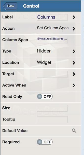
We will create a control element for the widget's pie chart in the widget map.
- Location — Mouse click
- Target — Widget3
- Action — Apply Filter
Once done, let's save the dashboard.
MDX2JSON and DeepSeeWeb installation
To visualize the created dashboard, you can use the following OpenSource solutions:
- MDX2JSON — REST API provides information about cubes, pivots, dashboards, and many other DeepSee elements, in particular the results of MDX request execution, which lets you embed the UI interface of a DeepSee-based analytical app into any modern web or mobile application.
- DeepSeeWeb is an AngularJS application offering an alternative implementation of a DeepSee user portal. Can be easily customized. Uses MDX2JSON as a backend.
MDX2JSON installation
In order to install MDX2JSON, you need to do the following:
- Download Installer.xml and import it to any namespace using Studio, System Management Portal or Do $System.OBJ.Load(file).
- Run the following command in the terminal (under a user with the %ALL role): Do ##class(MDX2JSON.Installer).setup()
To check the installation status, start the web browser and go to http://server:port/MDX2JSON/Test?Debug. You may need to enter your login and password (depending on the server's security settings). You should see a page containing server details. In case of an error, you can refer to Readme and Wiki.
DeepSeeWeb installation
In order to install DeepSeeWeb, do the following:
- Download the installer and import it to any namespace using Studio, System Management Portal or Do $System.OBJ.Load(file).
- Run the following command in the terminal (under a user with the %ALL role): Do ##class(DSW.Installer).setup()
To check the installation, open the http://server:port/dsw/index.html page in the browser. You should see the authorization page. The SAMPLES namespace has a number of ready dashboards and they all will be automatically shown in DeepSeeWeb.
Collecting polygon coordinates
To display the collected data on the map, you need a set of coordinates of administrative districts and regions of Moscow. They are available, for example, on the gis-lab website. These data will then be used by DeepSeeWeb, so we need to convert it to the format that DSW will be able to process:
Shortened code of moscowElectionsMap.js
function loadCoordinates(polygonCoordsArray)
{
polygonCoordsArray['Troitskiy administrative district'] =
'36.8031,55.44083,0 ... 37.37279,55.80868,0'
...
polygonCoordsArray['Nekrasovka region'] =
'37.90613,55.70626,0 ... 37.37296,55.80745,0
}
Let's save the resulting js file to the “web” folder of our application and we are done!
Creating a list of terms
We can also add a possibility to define map coloring criteria. If we are currently coloring the relation of the total number of voters to the population of a district/region, we can also add coloring by the relation of votes for a particular candidate to the total population. This can be done this way: we will create a list of terms (a list of key-value pairs), and the necessary value will be passed to the MDX expression of the request when a particular key is selected. The MDX expression of our pivot is as follows:
SELECT NON EMPTY {[Measures].[Putin],[Measures].[Zhirinovsky],[Measures].[Baburin],[Measures].[Grudinin],[Measures].[Sobchak],[Measures].[Suraykin],[Measures].[Titov],[Measures].[Yavlinsky],[MEASURES].[COLORRGBVALUE],[CUSTOM].[TooltipValue],[CUSTOM].[PopupValue]}
ON 0,NON EMPTY [Territory].[H1].[Region].Members ON 1 FROM [ELECTIONS2018CUBE]
Only the part enclosed in brackets will be replaced.
You can create a list of terms in the Term list manager – open the User Portal → Tools → Term List Manager
For Putin, it's going to be this string
- Key: 2. Putin
- Value:
{[Measures].[Putin]\,%LABEL([Measures].[Putin]/[Measures].[votersIncludedInVotersList]\,"ColorRGBValue")\,[CUSTOM].[TooltipValue]\,%LABEL("<b>" + [Territory].[H1].[Region].CurrentMember.Properties("name") + "</b><br/>Population: " + [Measures].[Population] + " ppl.<br/>Number of voters: " + [Measures].[votersIncludedInVotersList] + " ppl.<br/>Voted for Putin: " + [Measures].[Putin] + "ppl."\,"PopupValue")}
Let's now save the term list MoscowElections2018.
We will now create a control element on the dashboard settings page for the pivot containing a map:
- Location — Mouse click
- Action — Select special strings
- Click “OK”
Let’s define the name and the list of special columns
- Label — Coloring criterion
- List of special columns — MoscowElections2018.termlist
Done!
Additional capability: definition of the URL of the tile server
It should also be noted that DeepSeeWeb supports the ability to specify a path to the tile server to be used for requesting tiles (images) for the map instead of the one used by default — https://{a-c}.tile.openstreetmap.org/{z}/{x}/{y}.png.
We will skip the configuration of the tile server, since this information has been described on the Internet a lot of times.
To define the path to the necessary tile server, do the following:
- Create a json file with DeepSeeWeb settings or generate a ready one that is being used by DeepSeeWeb
- Specify an “app.tileServer” node with a value containing the URL of the necessary tile server
- Import the resulting json file with settings
Creation of a json file with DeepSeeWeb settings
The best way to create it is to edit the json file that is already being used by your application. To get it, click [] in the top part of the DeepSeeWeb window — a window with DeepSeeWeb settings will open.
Click on “Export settings”. Open the downloaded json file and add the “tileServer” node as a subnode of the “app” node. For this example, we will use the URL of OSM Wikipedia Maps — https://maps.wikimedia.org/osm-intl/{z}/{x}/{y}.png. Save the settings file. Open the DeepSeeWeb window and upload the resulting json file in the settings window. Done!
Conclusions:
We've shown an example of using a multi-model InterSystems Caché DBMS, OLAP DeepSee, DeepSeeWeb projects, and MDX2JSON. You have learned to create stored classes, cubes, pivots, dashboards, and come to see the beauty and convenience of components available both on the InterSystems Ensemble integration and app development platform, as well as in the multi-model InterSystems Caché DBMS and the new InterSystems IRIS Data Platform product.
The developed dashboards were uploaded to the demo server:
Links: