An introduction to Adaptive Analytics
Introduction
InterSystems IRIS Adaptive Analytics is an optional extension that provides a business-oriented, virtual data model layer between InterSystems IRIS and popular Business Intelligence (BI) and Artificial Intelligence (AI) client tools. Adaptive Analytics is powered by AtScale, the AtScale documentation can be found at this link: https://documentation.intersystems.atscale.com
This article will showcase some AtScale features that can facilitate data analysis:
- Cube creation
- Excel visualization
- Parallel Period
- Queries
- Snowflake
- Security
-
Aggregates
1. Cube creation
Creating a cube in AtScale is simple. Within the cube canvas, go to the Data Sources button, select your fact table (in our example, sales made) and drag it to the canvas. The fact table will be displayed with a blue header:
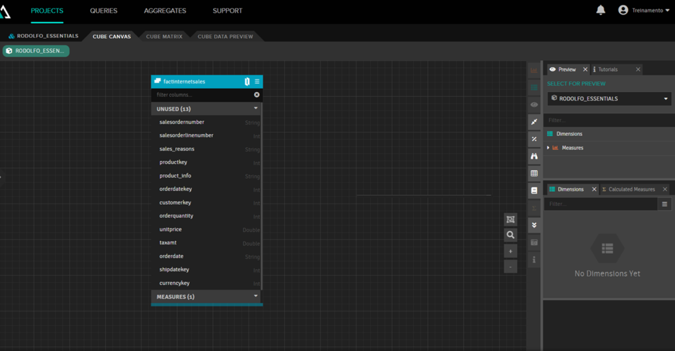
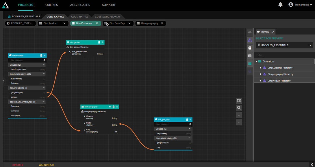
After that, you need to add dimension tables by dragging them to the Dimensions box on the right and linking them to the fact table by dragging and dropping the property containing the record ID. Then you need to add measures; simply drag and drop the fields to be measured to the Measures box on the right and specify the type of aggregation you want (sum, counter, average, etc.). The focus of this article is not to show this step, partly because it's difficult to show the drag-and-drop process in images, so we only show how our model looks:
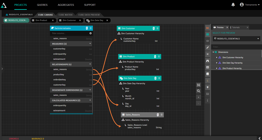
Notice that our Sales_Reasons dimension has a gray header. This happens because it's a junked dimension, which is a dimension created from a fact table property that has no relationship with another table. To create it, simply drag the property you want to turn into a dimension to any blank space on the canvas.
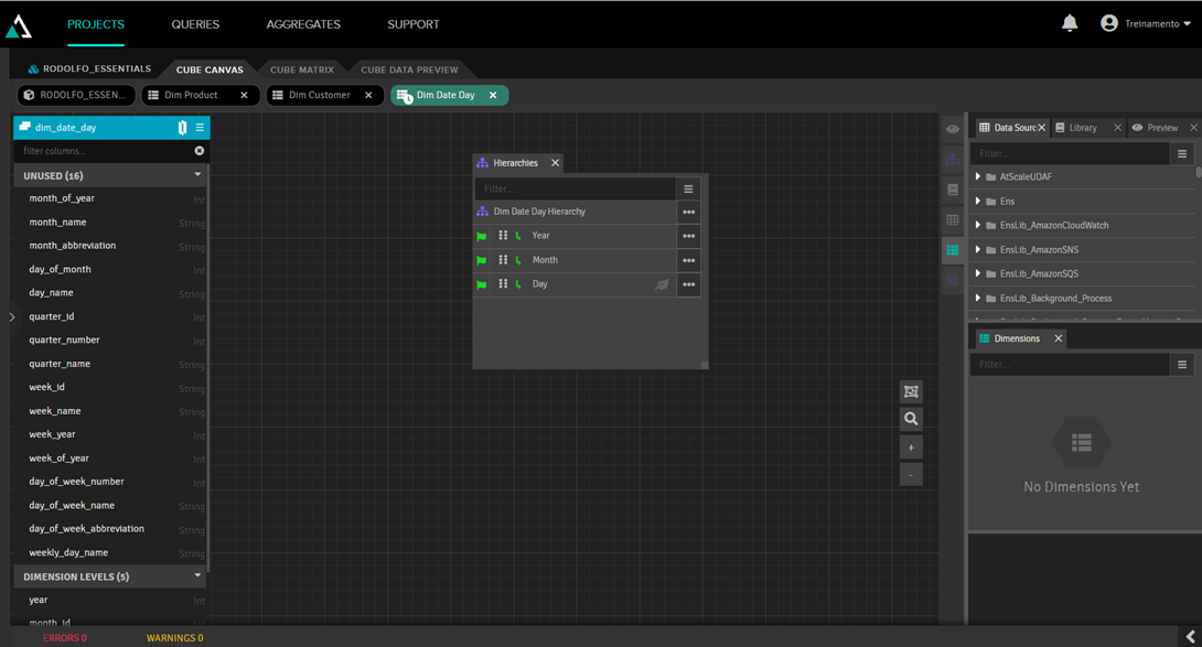
Another observation is that we added the calendar dimension, which is a table with fixed data for all calendar dates, detailing the day, day of the week, month, year, quarter, etc. In this dimension, we established a hierarchy of year, month, and day to create a drilldown for the user. To do this, we double-clicked the dimension to access the dimension editor, where we entered the year, month, and day in its hierarchy:
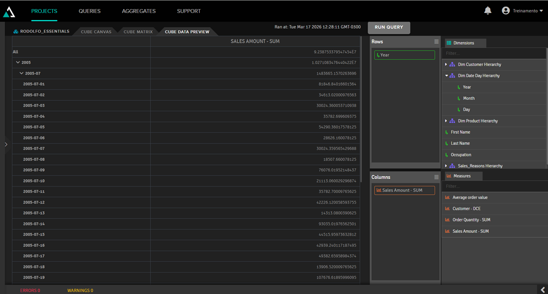
By clicking on the Cube Data Preview tab, we can see how the data will look:
2. Excel visualization
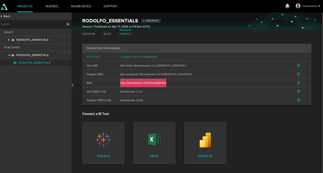
To view data from an external application (Power BI, Tableau, Excel), you first need to publish the cube. To do this, simply click Publish. After that, the connection strings will be displayed:
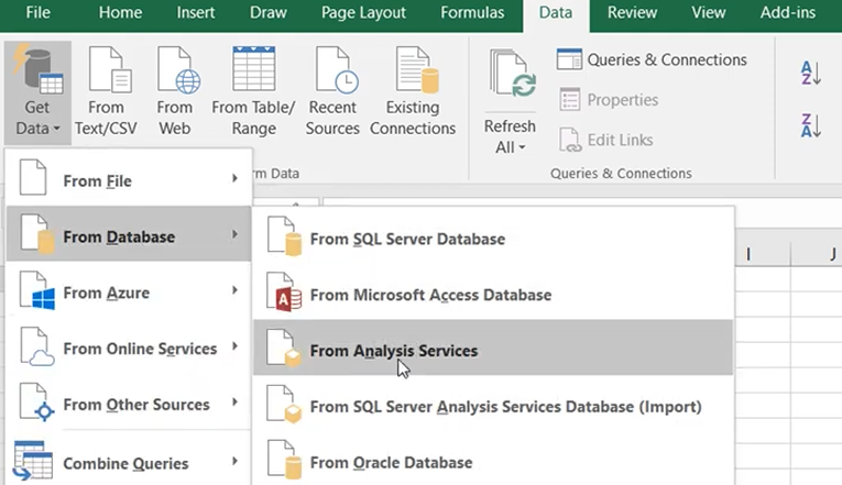
With this string in hand, select the "From analysis server" option in Excel to retrieve the data from AtScale:
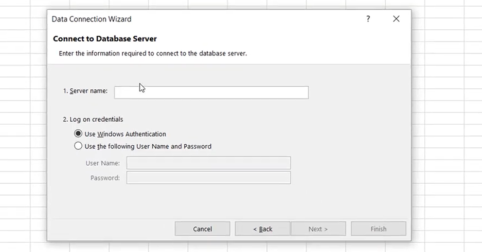
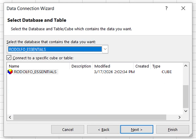
On the screen above, simply enter the connection string in the Server Name field and provide the AtScale username and password. Then select the cube:
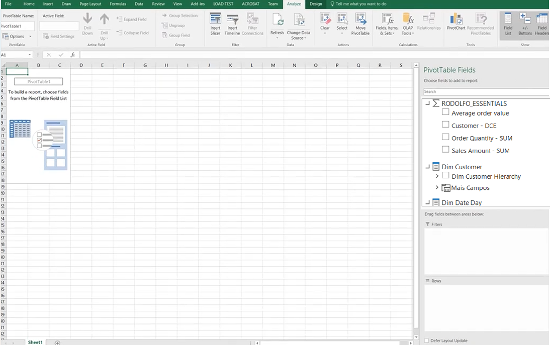
Then the data will appear as a pivot table:
3. Parallel period
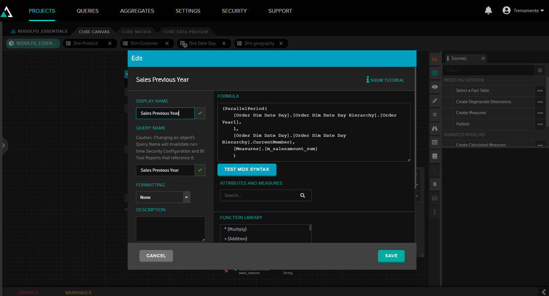
Parallel Period is a very useful function for comparing data from different periods (a very common situation is needing to compare current year sales with the previous year's sales). In AtScale, this is done by adding a calculated measure and using the ParallelPeriod function, like this:
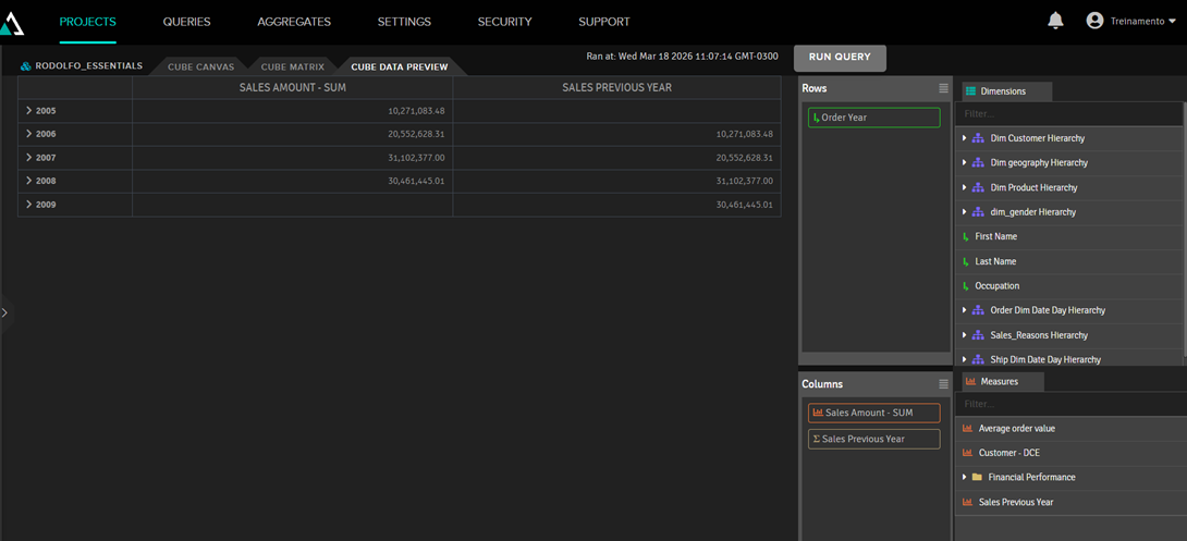
Therefore, the Sales Previous Year metric will show the value for a year ago:
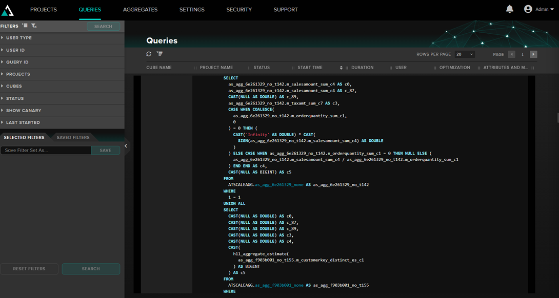
4. Queries
In the Queries section of AtScale, we see the queries that are being executed, both by external applications like Excel and by the AtScale preview. Example of a query:
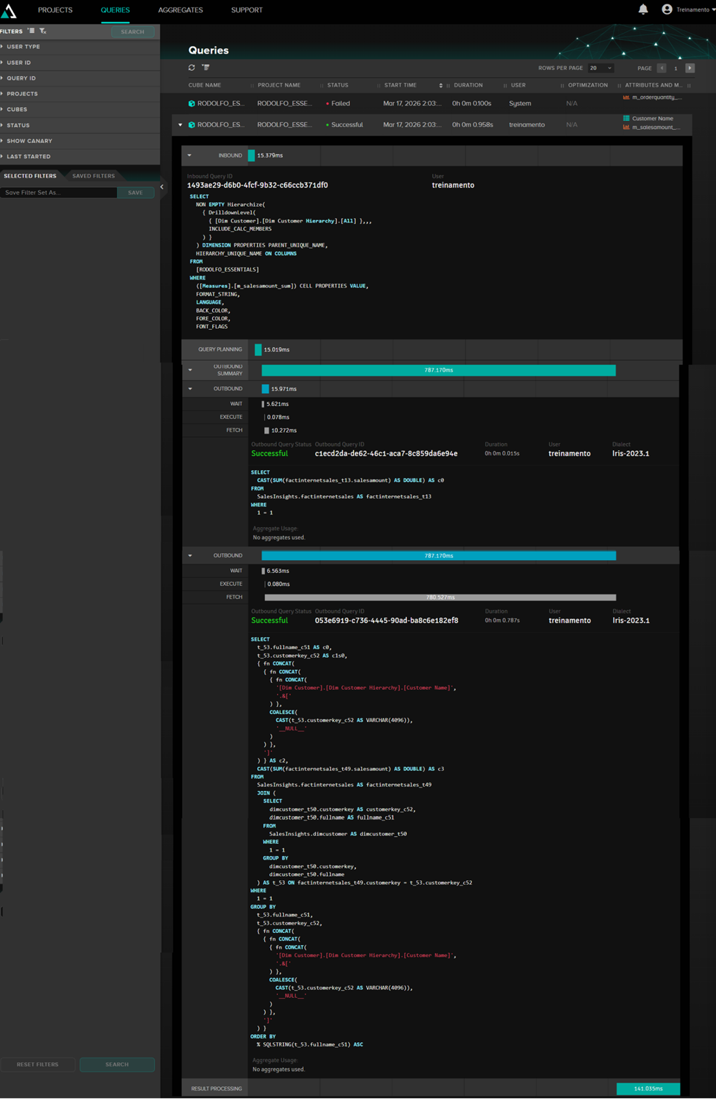
Here we can see the internal MDX query of AtScale and the query that is passed to Iris, as well as the execution time.
5. Snowflake
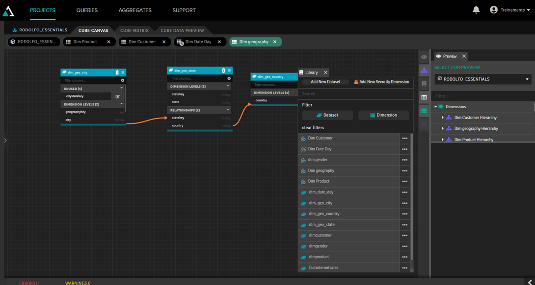
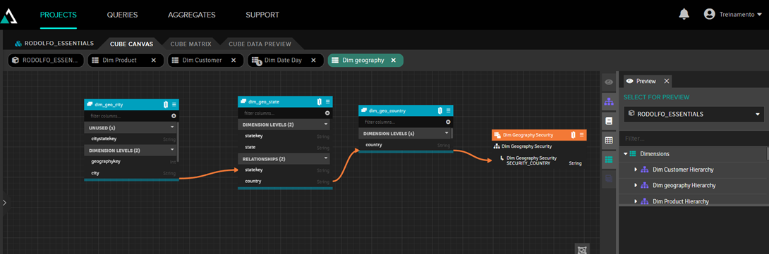
Snowflake refers to the ability to expand the model. In the example below, we enter the customer dimension and expand it by adding geographic information, through a table of cities, as well as gender information:
In this way, we can add tables to the model while maintaining an easy-to-understand organization.
6. Security
We will divide the security aspect into two topics: perspectives, which limit which columns a user can see, and security dimension, which limits which rows a user can see.
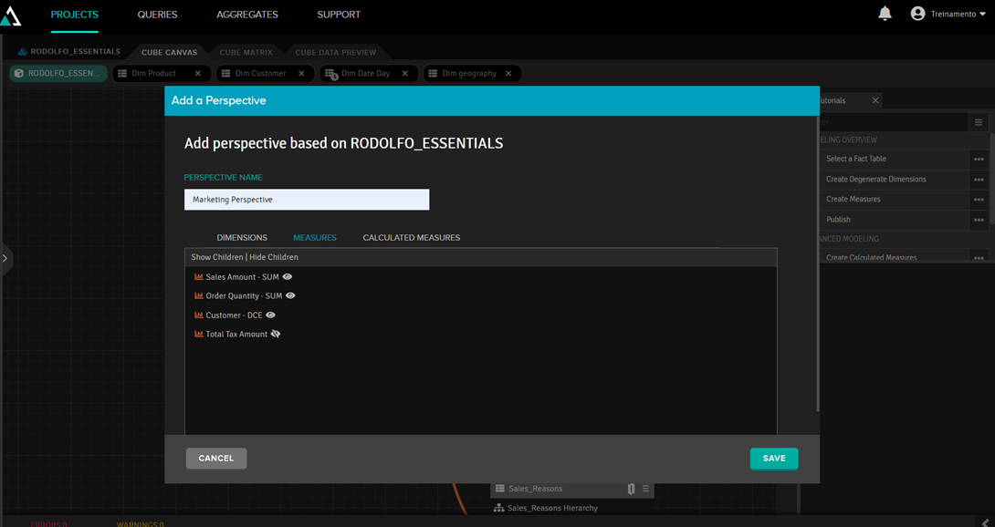
a) Perspectives
Perspectives serve to define the scope of a cube, in case there are users who cannot see all the data. In the example below, we created the marketing perspective. By clicking on the "eye," we define what they can and cannot see:
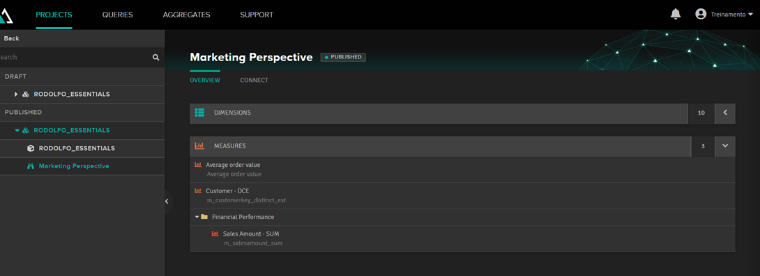
When you publish the cube, another post will appear with the perspective name and its connection strings:
b) Security dimension
The security dimension is applied to the data, as if it were a filter. For example: users from Australia can only see data related to Australia.
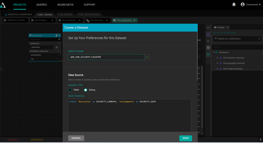
To do this, you first need a table that specifies what each user can view. This can be a normal database table, but in our case we will create a fictitious table using the "add new dataset" option:
In this dataset, we will create an SQL query with the fixed data:
After that, we click on “Add new security dimension” and enter the data from the dataset we just defined:
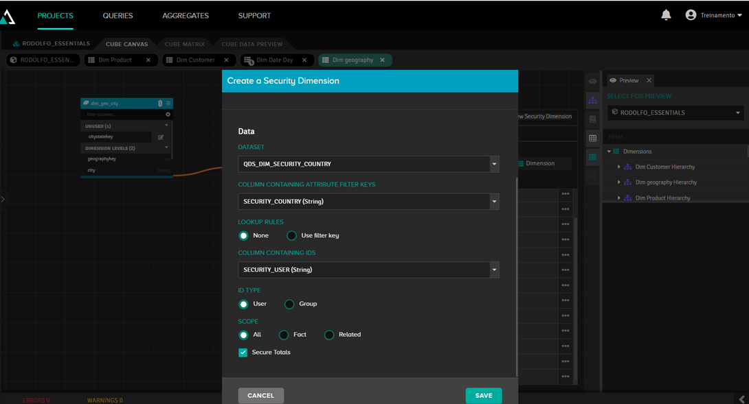
Next, we link it to the "country" field, since this is the field that will be filtered:
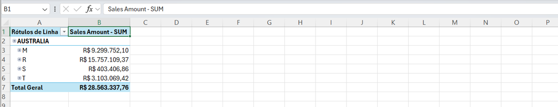
From now on, when running the table in Excel with the user 'treinamento', we will only see the data for Australia:
7. Aggregates
Aggregations in AtScale are optimized tables that contain pre-calculated and summarized data (such as sums, averages, or counts) from fact datasets. These tables are designed to improve query performance, as AtScale can read summarized data instead of processing billions of rows of raw data in real time.
In the Aggregates tab, we can see the created aggregation tables:
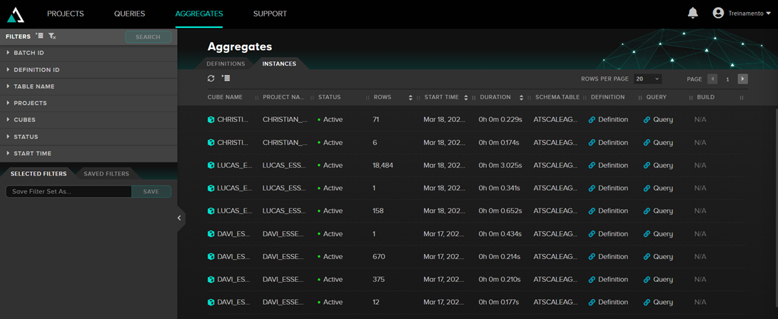
When AtScale is using aggregations, looking at the query being executed, you can see that the tables being read are those named ATSCALEAGG.as_agg_xxxx.
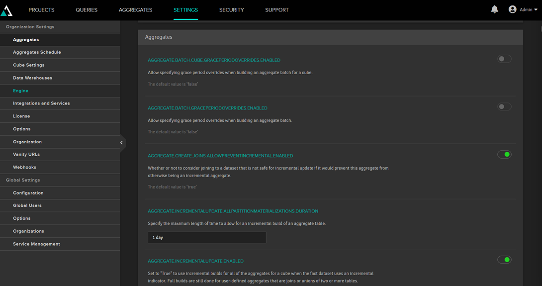
These aggregation tables are stored in IRIS. In the AtScale settings, it's possible to define which package they will be stored in (in the example above, ATSCALEAGG) and even whether we want to store them in a namespace or a separate IRIS instance.
AtScale decides whether or not to use aggregations. The most important criterion is whether the aggregation table will actually be smaller than the fact table. By default, AtScale uses a ratio of 3, so if the aggregation table is 3 times smaller, it will create the table. This is not fixed and can be changed in the AtScale settings.
a) Updating the aggregates
Aggregation tables should be updated periodically to reflect changes in the facts. By default, this is done daily; it's in the settings:
It is also possible to create schedules for updating:
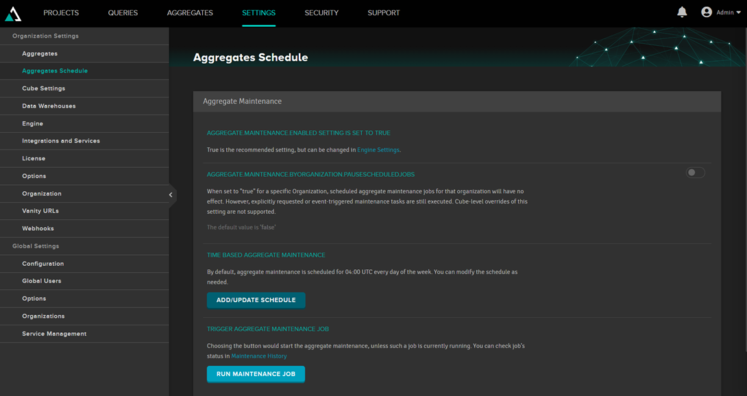
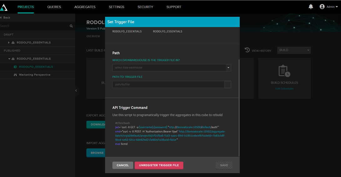
Or you can call a trigger to perform this update, so you can call the update from some external program:
Conclusion
I hope that this article has shown some of the features of Adaptive Analytics, helping to provide an overview of the capabilities of this tool.