IRIS Climate Change application that shows how temperature is increasing worldwide as a proof of global warming
Hi Community,
This post is a introduction of my open exchange iris-climate-change application.
iris-climate-change web application Imports The Food and Agriculture Organization (FAO) Climate Change dataset by using LOAD DATA (SQL) functionality and analyze and visualize data with the help of Python Flask Web Framework, Pandas Python data analysis Library, Plotly Open Source Graphing Library for Python and Plotly JavaScript Open Source Graphing Library.
Dataset and License details:
The Food and Agriculture Organization (FAO) Climate Change dataset : The FAOSTAT Temperature Change domain disseminates statistics of mean surface temperature change by country, with annual updates and the other dataset have country codes.
LICENCE Details
In this post I will demonstrate the below:
- How to import dataset by using python panda and plotly libraries and display on webpage with the help plotly javascript open source graphing library
- Bar Chart to display Top Ten countries that suffer from temperature change mostly in the last ten years
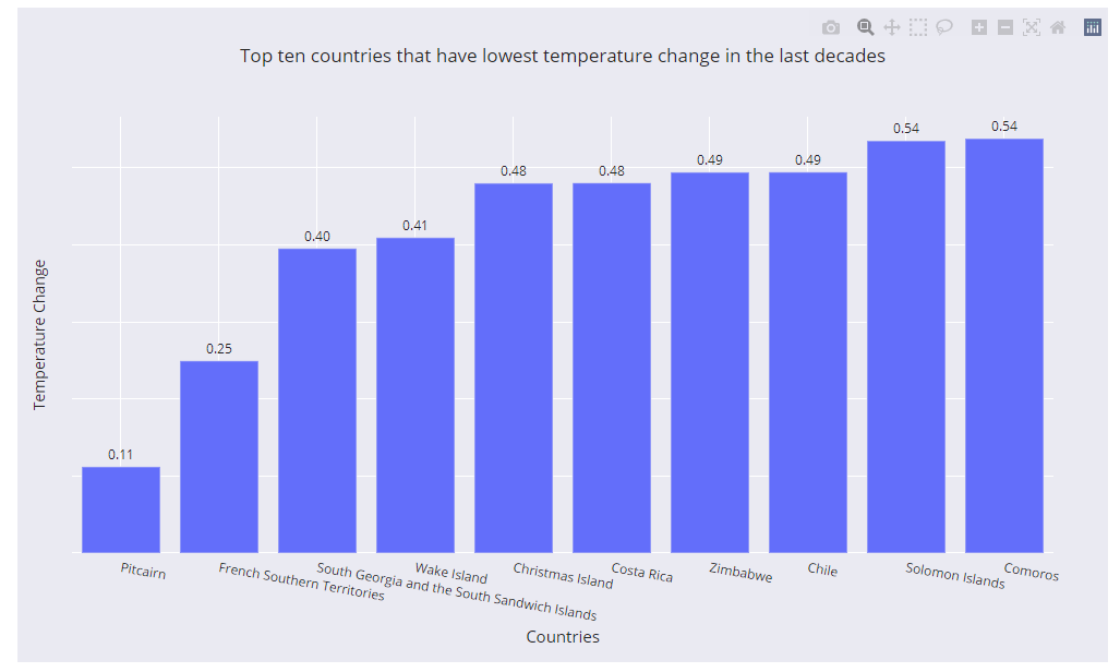
- Bar Chart to show ten countries that suffer from temperature change at the very least in the last ten years
- Line Chart to show any remarkable trend between the years according to World, annex I countries and non-annex I countries
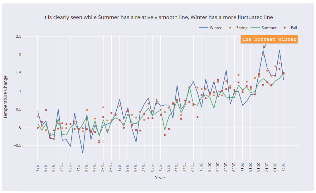
- Line Chart to show any significant difference between seasons from 1961-2021
- Radar chart to show trend of temperature change in the world from 1961-2021
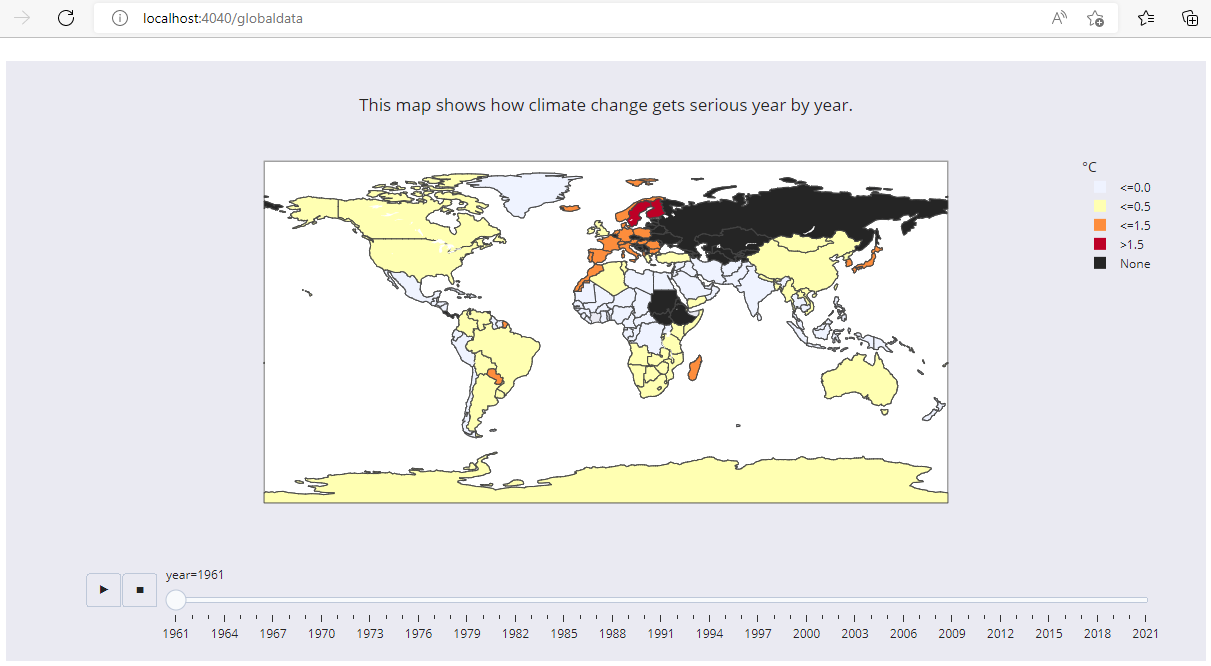
- Map Animation to show global surface climate change from 1961 to 2021.
1-Importing dataset
In order to import dataset we will use following ImportDS() class method of dc.climatechange.utility class:
Class dc.climatechange.utility
{

ClassMethod ImportDS() As %String
{
    //Dynamically create country table
    Do ..GetColTypes("/opt/irisapp/src/data/climatechange/FAOSTAT_data_11-24-2020.csv",.coltype)
    SET tableName= "dc.ClimateChange.Countries"
    SET qry = "CREATE TABLE "_tableName_" ("_coltype_")"
    SET rset = ##class(%SQL.Statement).%ExecDirect(,qry)
    //Check if table created successfully
    IF rset.%SQLCODE
    {
        WRITE rset.%Message,!
    }
    ELSE
    {
    //Load DATA to country table
        SET qry = "LOAD DATA FROM FILE  '/opt/irisapp/src/data/climatechange/FAOSTAT_data_11-24-2020.csv' INTO dc.ClimateChange.Countries USING {""from"":{""file"":{""header"":""0"",""skip"":""1""}}}"
        SET rset = ##class(%SQL.Statement).%ExecDirect(,qry)
        IF rset.%SQLCODE
        {
             WRITE rset.%Message,!
        }
    }

    //Dynamically create Climatechange data
    Do ..GetColTypes("/opt/irisapp/src/data/climatechange/Environment_Temperature_change_E_All_Data_NOFLAG.csv",.coltype)
    SET tableName= "dc.ClimateChange.Data"
    //SET coltype = "AreaCode NUMERIC(3,0), Area VARCHAR(100),MonthsCode NUMERIC(4,0),Months VARCHAR(20),ElementCode VARCHAR(4), Element VARCHAR(100), UNIT VARCHAR(3), Y1961 NUMERIC(7,3)"
    SET qry = "CREATE TABLE "_tableName_" ("_coltype_")"
    SET rset = ##class(%SQL.Statement).%ExecDirect(,qry)
    //Check if table created successfully
    IF rset.%SQLCODE
    {
         WRITE rset.%Message,!
    }
    ELSE
    {
         //Load DATA statement
        SET qry = "LOAD DATA FROM FILE  '/opt/irisapp/src/data/climatechange/Environment_Temperature_change_E_All_Data_NOFLAG.csv' INTO dc.ClimateChange.Data USING {""from"":{""file"":{""header"":""0"",""skip"":""1""}}}"
        SET rset = ##class(%SQL.Statement).%ExecDirect(,qry)
        IF rset.%SQLCODE
        {

             WRITE rset.%Message,!
        }
    }
    return ""
}

// Get column lists based on the Header Row of CSV File
ClassMethod GetColTypes(filenamecsv As %String, ByRef coltype As %String, dlm As %String = ",")
{
    SET coltype=""
    SET stream=..GetStreamFromFile(filenamecsv)
    SET header=stream.ReadLine() // Get Header columns
    //SET header=$ZCONVERT(header,"L")
    SET dataLine=stream.ReadLine() // Read First line of data
    //Read all the columns of header and add datatype against it
    FOR i=1:1:($Length(header,dlm)) {
        kill types
        //Get datatype of the column
        DO ..GetDataType($Piece(dataLine,dlm,i),.types)
        SET type=..GetType(.types)

        // if type is varchar then assign length 250
        IF type="VARCHAR" SET type="VARCHAR(250)"
        SET $Piece(coltype,dlm,i)=$TR($Piece(header,dlm,i)," ","")_" "_type
    }
    SET coltype=$TR(coltype,dlm,",")
    // change "." symbol in column names
    SET coltype=$TR(coltype,".","_")
}

ClassMethod GetStreamFromFile(filename As %String) As %Stream
{
    // create new stream and link to the file
    SET stream = ##Class(%Stream.FileCharacter).%New()
    SET stream.LineTerminator = $Char(13,10)
    $$$TOE(sc,stream.LinkToFile(filename))
    RETURN stream
}

ClassMethod GetDataType(value As %String, ByRef types) As %Status
{

   //Get datatype based on the first column value
   if $IsvalidDouble(value) {
       if $I(types("DOUBLE"))
       if $L(value,".")>1,$L($P(value,".",2))<10 if $I(types("MONEY"))
       if ($L(value,".")=1) if $I(types("INTEGER"))
   quit $$$OK
   }
   if ..IsDate(value) {
       if $I(types("DATE"))
       Quit $$$OK
   }
   if $I(types("VARCHAR"))
   return $$$OK
}

ClassMethod GetType(ByRef types) As %String
{
    If $D(types("MONEY")),$D(types("DOUBLE")) {
        if types("MONEY")=types("DOUBLE") return "MONEY"
    }
    SET i=$Order(types(""))
    while i'="" {
        SET typesI(types(i))=i
        SET i=$Order(types(i))
    }
    if $D(typesI) return typesI($Order(typesI(""),-1))
    return "VARCHAR"
}

ClassMethod IsDate(pVar As %String = "") As %Boolean
{
    SET sts=$$$YES
    Try {
        If $ZDateH(pVar,5)
    }
    Catch e {
        SET sts=$$$NO
    }
    Quit sts
}
}
dc.climatechange.utility class method ImportDS dynamically create tables based on the CSV files by considering first line as column names and next line to guess datatype. After creating table LOAD DATA sql command imports data to the tables.
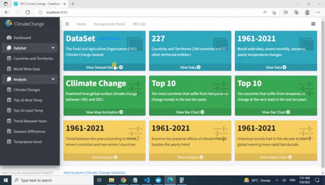
"src\data\climatechange\" directory contains two files, FAOSTAT_data_11-24-2020.csv file contains countries and territories which will create ClimateChange.Countries table, while Environment_Temperature_change_E_All_Data_NOFLAG.csv file contains climate history data and will create ClimateChange.Data table. Data can be view from application sidebar DataSet menu OR by clicking view data from dashboard related Tab OR directly from Management portal.
2-To display Ten countries that suffer from temperature change mostly in the last ten years we will use following python, HTML and javascript code
#Ten most countries that suffer from temperature change mostly in the last ten years
@app.route("/mosttemp")
def mosttemp():
    #Get DataFrame
    df = getDataFrame()
    #Create a copy of DataFrame
    df_c =df.copy()
    df_c.set_index("year", inplace=True)
    df_c = df_c.loc[['2010','2011','2012','2013','2014','2015','2016','2017','2018','2019']]
    df_c.reset_index(inplace = True)
    #Group by country name
    df_c = df_c.groupby(
    ['country name',]
    ).agg(
        {
            'tem_change':'mean',

        }
    )
    df_c.reset_index(inplace = True)
    #applying sorting
    df_c = df_c.sort_values(by=['tem_change'],ascending=False).head(10)
    #adding titles
    fig = px.bar(df_c, x="country name", y='tem_change' ,text='tem_change',
    title="Top ten countries that have highest temperature change in the last decades"
           "<br>The top ten list shows Europe and some European countries. It also has been illustrated that Europe"
           "<br> is affected mostly by climate change. And not surprisingly, all countries on the list are industrialized countries,"
           "<br> excluding 'Svalbard and Jan Mayen Islands'." )
    fig.update_traces(texttemplate='%{text:.2s}', textposition='outside')

    # adjusting size of graph, legend place, and background colour
    fig.update_layout(
        autosize=False,
        width=1000,
        height=600,
        margin=dict(
            l=50,
            r=50,
            b=100,
            t=100,
            pad=4
        ),

        template='seaborn',
        paper_bgcolor="rgb(234, 234, 242)",
        legend=dict(
            orientation="v",
            yanchor="bottom",
            y=0.3,
            xanchor="left",
            x=1.02
    ))
    fig.update_xaxes( tickangle = 10,
            title_text = "Countries",
            title_font = {"size": 15},
            title_standoff = 0)
    fig.update_yaxes(showticklabels=False,tickmode="auto", title='Temperature Change',title_standoff = 0)
    #Converting dataframe to JSON in order to display on web
    graphJSON = json.dumps(fig, cls=plotly.utils.PlotlyJSONEncoder)
    #rendering main.html page by passing json object
    return render_template("main.html", fig=graphJSON)

    def getDataFrame():
    df= pd.read_csv("/opt/irisapp/src/data/climatechange/Environment_Temperature_change_E_All_Data_NOFLAG.csv", encoding='latin-1')
    #Get data from IRIS
    statement = iris.sql.exec('SELECT Country as "Country Name", ISO3Code as "Country Code" FROM ClimateChange.Countries')
    df_countrycode = statement.dataframe()

    #Renaming columns
    df.rename(columns = {'Area':'country name'},inplace = True)
    df.set_index('Months', inplace=True)
    df.rename({'Dec-Jan-Feb': 'Winter', 'Mar-Apr-May': 'Spring', 'Jun-Jul-Aug':'Summer','Sep-Oct-Nov':'Fall'}, axis='index',inplace = True)
    df.reset_index(inplace = True)

    #Filtering EndYear
    df = df[df['Element'] == 'Temperature change']

    #Merging with df to df_country
    df = pd.merge(df, df_countrycode, how='outer', on='country name')

    #Drop unwanted columns
    df.drop(['AreaCode','MonthsCode','ElementCode','Element','Unit'],axis=1,inplace=True)

    #Channing dataframe organization
    df = df.melt(id_vars=["country code", "country name","Months",], var_name="year", value_name="tem_change")
    df["year"] = [i.split("Y")[-1] for i in df.year]

    return df
<script src="/static/assets/plugins/plotly/plotly-latest.min.js"></script>
<script>
Plotly.newPlot("myPlot", {{ fig | safe }})
</script> <div id="myPlot"></div> Above python code use python panda library to read countries and historical data, apply filtration and dump data to JSON and pass to HTML file then Javascript code use plotly-latest.min.js javascript libraries to draw JSON to below bar graph in HTML div tag.

Above Bar chart shows top Ten countries that have highest temperature change in the last decades, It has been illustrated that Europe is affected mostly by climate change and not surprisingly all countries on the list are industrialized countries, excluding Svalbard and Jan Mayen Islands
3-To display Ten countries that suffer from temperature change at the very least in the last ten years leasttemp() python function will be used along with above HTML and javascript

4-To display Trend between the years according to World, annex I countries and non-annex I countries trendyears() python function will be used along with above HTML and javascript

It is clearly seen in above line chart that Annex | countries has a relatively smooth line then Non-Annex countries.
5-To Examine the seasonal effects of climate change besides the yearly trend seasons() python function will be used along with above HTML and javascript

6-To Examine the seasonal effects of climate change besides the yearly trend trendtemp() python function will be used along with above HTML and javascript

7- And finally to Examined how global surface climate change between 1961 and 2021 globaldata() python function will be used along with above HTML and javascript

Above map animation uses globaldata() function which read the data by calling getDataFrame() function which filter the year based data and use express choropleth for animation plot with the help of plotly.exress and plotly.graph_objects libraries. Adjust size of map, place legends and change colors by using plotly.graph_objects update_layout function.
Conclusion:
We examined how global surface temperature change between 1961 and 2021. When examining the top ten areas that have the highest temperature change in the last decade are mostly industrialized countries. Additionally, We found that temperature increased every ten decades, and the last decade can count as the hottest decade. From our above analysis result, We came up winter season getting more hotter. Finally, We tried to show how temperature is increasing worldwide as a proof of global warming. we analyzed deeper climate change effects in animation map; this shows how climate change gets serious year by year.
Voting:
If you found this app useful, consider it for voting
Thanks