iPhone Chrome does not display the same as desktop Chrome
Hi,
It has been pointed out to me that one of my applications fails to display all of the contents when displayed on an iPhone or a tablet of smaller res that a desktop screen.
Desktop..
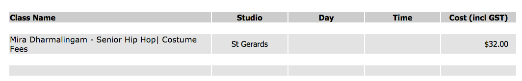
iPhone..

The code does not change between the two views of the same page.
To maintain easy alignment and control, I have used standard <tr> and <td> <table> codes, expecting same behaviour in any browser on any platform. My guess is using <div> controls for display will make a difference, but I'd be interested if anyone has any experience of this kind and if there is a simple fix.
The code snippet doing this display..

Thanks,
Rosti.
Comments
Hi Rosti,
I suspect the problem is on both the desktop and on the iphone, if you squeeze down the size of the desktop browser you will probably also see the table expanding beyond the width of the visible viewport.
You might want to take a look at using table layout fixed, and allow text to overflow, take a look at the codepen examples listed on this page...
https://css-tricks.com/fixing-tables-long-strings/
You don't have many columns so this type of fix would be just about ok with users, any more information and I would suggest going for a card layout on the mobile device.
Sean.