InterSystems Reports: Secrets of Fine tuning at properties of tables and graphics
In this article, we will analyze the intricacies of setting up tables and graphs to improve the readability of data.
Logi offers a rich set of data visualization tools. You can find anything from a wide variety of chart templates to custom CSS styles. Understanding the assortment of settings and options can be quite difficult. First, we will create a chart and a table with default settings, and give them a presentable look using InterSystems Reports (powered by Logi Report).
Graphic
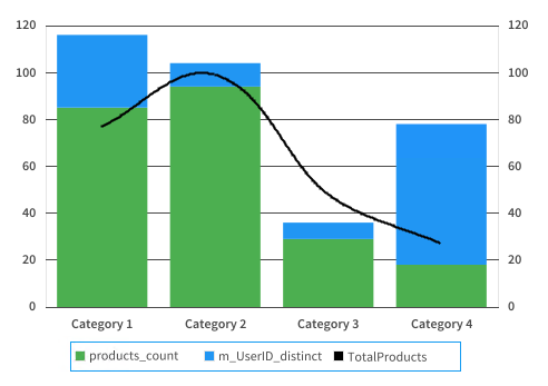
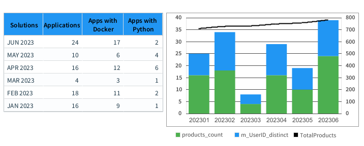
Suppose we need to display three directions of data at once on one chart. The data source in our example would be products_count (number of apps by month), m_UserID_distinct (number of members), and TotalProducts (total number of apps). The result, in this case, would look like the chart below.
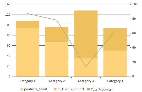
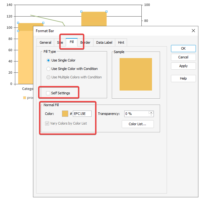
As you can see, InterSystems Reports (powered by Logi Report) automatically chose colors and settings for us. However, we are not satisfied with the default parameters because we want to design everything ourselves, and we can actually do it since it is possible to edit absolutely all elements of the chart. First, let's choose brighter and more informative colors for the columns and the curve. To do that, double-click or right-click any column and select Format 2D Bar in the context menu. In the window that appears, select the Fill tab, check the Self Settings item, and look attentively at the Normal Fill part.
Click on a color and choose the one that suits your needs. The color palette understands colors in HEX format. In our example, there will be #2196F3 for the first level of the Stacked Bar and #4CAF50 for the second one.
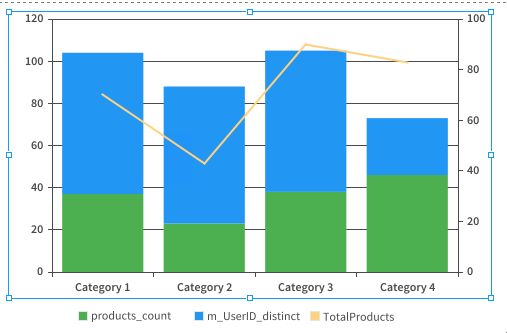
It's getting better already! Now we need to set the appropriate color for the curve. To make it happen, double-click the curve. In the window that appears, check the Self Settings box and pick the color in the Fill frame. In our example, we used black.
Additionally, you can check the Smoothed Line item to make the curve bend more smoothly at the vertices.

You can click the Apply button to apply and view the changes immediately.

Great! We have set bright and eye-catching colors. Now you can customize the background and marking lines. Let's edit the bottom marking line first.
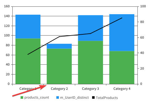
To do that, double-click it or select Format Category (X) Axis from the context menu. In the window that appears, go to the Axis tab, then to the Line frame, click Style, and select Invisible.

On the same tab, you can change the date category field by unchecking the Auto checkbox and selecting the required field from the list. Keep in mind that the date you are changing to must be in the same dimension.
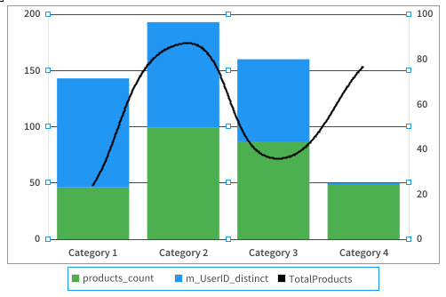
We've got the following chart.

Now, it is time to remove the lines of labels on both Y coordinates. To do that, click on the table and select Format Value (Y) Axis from the menu.
In the menu that will appear in the Line frame, click Style and select Invisible.

We should also repeat the same procedure for the second Y coordinate.
The result we have got looks like the table below.
It is concise and not overloaded now, so let's create a frame for it. To do that, select the Format Paper menu and go to the Border tab in the window that will open. There, click on Border Type and pick Solid.
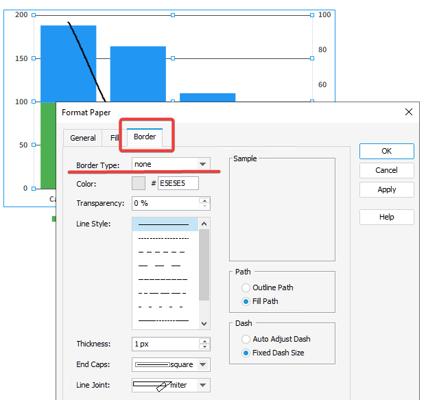
Select a more saturated color in the Color item and click OK.
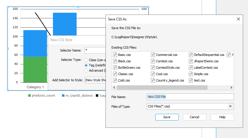
In this part, we designed the chart, made it more readable and not overloaded with details. You can save the resulting style and use it in future plots. To do that, select Save Style from the context menu of the table.
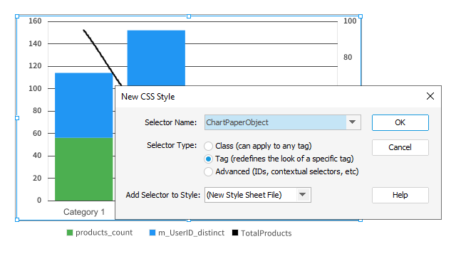
In the window that will appear, select the * symbol in the first line and click OK. In the next window, you will be prompted to give a name to the new style, so choose the one you need and save it.
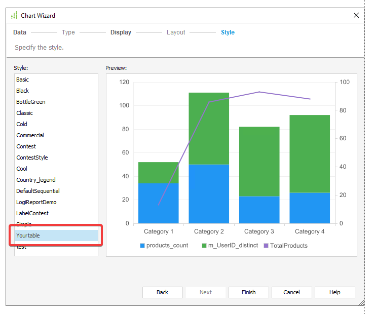
After that, the new design style will become available from the table creation menu in the Style tab.
Table
Now we will design a table with several indicators. InterSystems Reports (powered by Logi Report) provides powerful tools for fine-grained table editing. Here we will analyze some basic tools that can be useful for you in daily analytics.
In our example, there will be a table of four indicators grouped by the numerical date MonthYearNum (YYYYMM).

It does not representative at all. The table takes up too much space because of all the data. Yet, we can fix everything with ease. Let's start with the size and number of lines. First, let's limit the amount of data. To do that, open the Table Wizard and go to the Group tab. Select the dimension by which our data will be grouped (in our case, it will be the Month_Year_Num_calendarSol dimension), and press Select N.
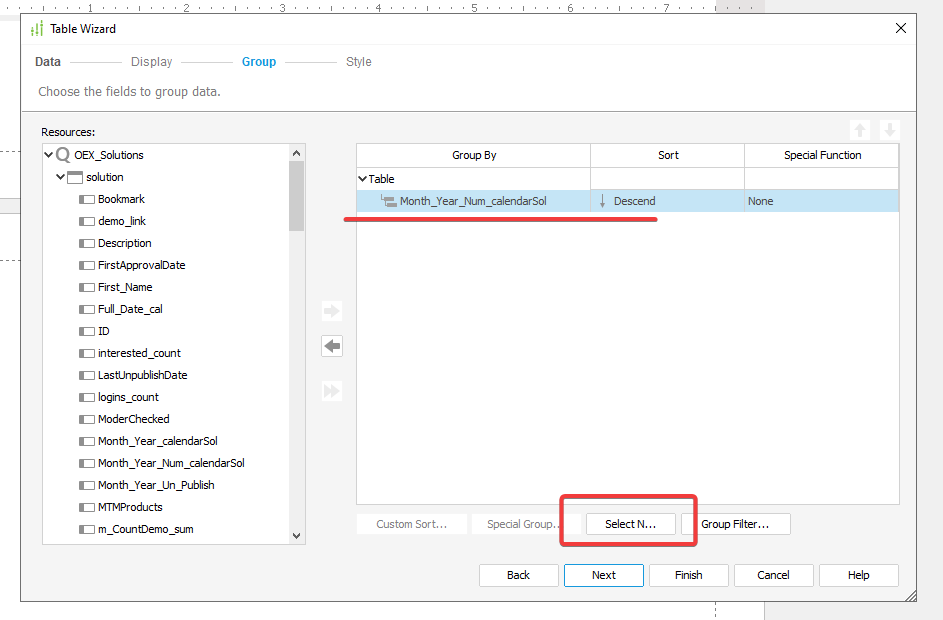
In the window that will appear, select Select N. Since we have the Decsend order, pick Top N. In our case, we will have 6 rows.
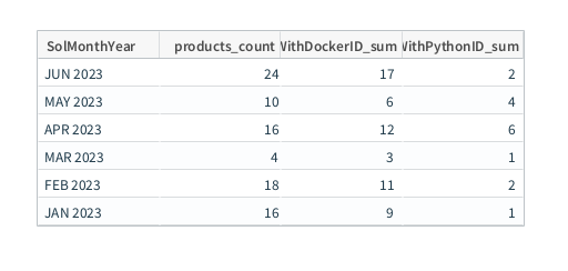
When we have formed a table, we will see only six rows. It is precisely what we need.
The next step will be to remove the extra columns and rows. We will get rid of the GC (Group Column) column, the GF (Group Footer), and TF (Table Footer) rows.

To do that, select the column by clicking on the GC and pick the Hide Column item from the menu. We should do the same with strings. Choose GF and TF in turn, and select Hide from the menu. After we have hidden the GC column, we will have the GH row. To conceal the latter, we will have to follow the same procedure. As a result, we will get a concise table that covers only relevant data.
Now we will change the labels and give meaningful names to the columns. To do that, you need to select the label first. Then, on the right side of Properties, go to the Text Format section, find the Text field, and enter your value. When finished, press Enter. Otherwise, just double-click the label and enter the text you need.

Take the same steps we have described above with the rest of the labels.
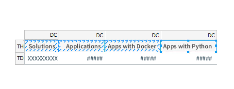
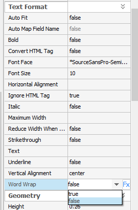
When all the labels have been renamed the way we want, we can finally set the dimensions for the table. In our example, the table will be placed to the left of the graph, which means we need to shorten the rows as much as possible. Labels are the limit, so we need to get them halved in size. To implement that, InterSystems Reports (powered by Logi Report) has developed the functionality of wrapping lines. To use that option, hold down CTRL, select all columns one by one, and in Text Format on the right side select Word Wrap = True.
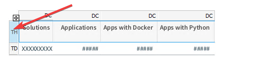
Your next step is to stretch the cells in height. To do that, select the line by pressing TH and set the Height value to the one you need. You can adjust the height by trying different values, or you can just stretch the cells manually by hovering over the border between the lines until the arrow icon appears. (As practice shows, setting the value in the Height field is a more convenient option).
After changing the row height, don't forget to increase the value in the cells by the appropriate one!
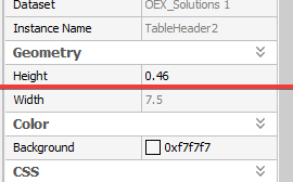
All you need to do is to hold down CTRL, and, while doing that, repeat the selection of each value in the table. Then, you should also set the Height value in the parameter set on the right side (in our case it will be 0.46 inches).
Now, you need to reduce the width of the cells in order to transfer a part of the name to the following line. To achieve that, we should highlight the TH (Table Header) row.
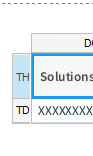
Then, go to the Inspector on the right side and select the appropriate cells. Please note that we did not pick cell number 50 because it had been hidden. Yet, at this point, click the Table Header row again to deselect it, since we only need to resize the Table Cell.

When finished, select the required value by changing it in the Height field. In our case, the size is 0.8 inches.
Below you can see a table you should receive as a result.

The next step is to align the text inside the labels. To do that, re-select the cells and pick the center alignment in the Format tab at the top.

Our table is almost ready! The only part that is missing is to apply the fill for the labels.
Highlight the line once more by clicking the TH icon.
On the right side, proceed to the Color section, find the Background field, and change the color to an arbitrary one (in our case it will be 0x2196f3 - blue).
The remaining part is to place the table next to the graph. To make that happen, we should reduce the chart we created earlier by pulling the corner and placing it at the same height as the table.
The result we got is illustrated below.
In this article, we examined the basic ways to format charts and tables. We have learned how to apply fill, change the size of various elements, adjust the values of labels, and modify the number of chart elements.