Comparison of Python&Dashboards
In the previous article, we told you about python and dashboard, and in this article I will compare them with each other.If you are just about to get started with visualization in Python, the number of libraries and solutions will definitely amaze you:
- matplotlib
- Seaborn
- Plotly
- bokeh
- Altair
- Folium
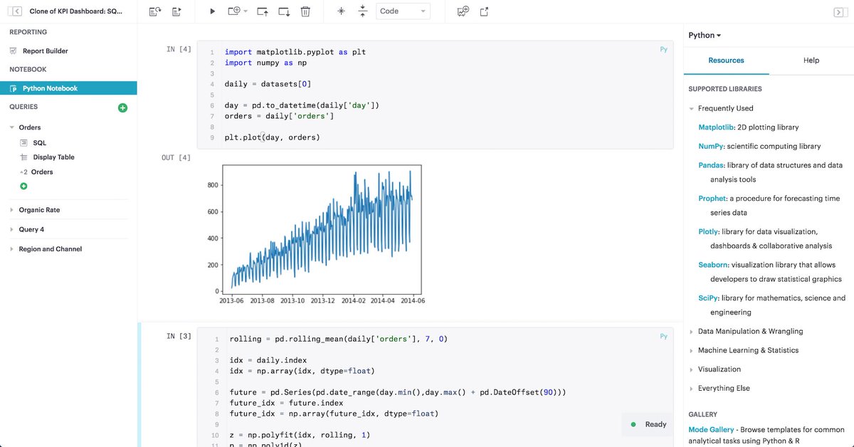
A visualization in some libraries, such as Matplotlib, is a simple static image, which is good for explaining concepts (in a document, on slides, or in a presentation).
Other libraries such as Altair, Bokeh, and Plotly allow you to create interactive plots that users can explore by interacting with them.
What should you know about syntax and flexibility !?
Low-level libraries like Matplotlib let you do whatever you want, but at the expense of a more complex API. Some libraries, such as Altair, are very declarative, making it easy to plot your data.
Briefly about the most important, to help you make the right choice.
Anything can be created with Matplotlib, but complex plots can require a lot more code than other libraries.
Plotly is great for creating interactive and high-quality plots with just a few lines of code.
Altair is ideal for creating complex graphs to display statistics. Altair cannot handle more than 5,000 instances of data, and some of the simple charts in it are inferior in style to Plotly or Seaborn.
Bokeh is the only library whose interface ranges from low to high, making it easy to create both versatile and complex graphics. However, the price of this is that it usually takes more code to generate plots with similar quality to other libraries.
Bokeh is the only library whose interface ranges from low to high, making it easy to create both versatile and complex graphics. However, the price of this is that it usually takes more code to generate plots with similar quality to other libraries.
Folium allows you to create an interactive map in a few lines of code. It gives you a feeling close to using Google Map.
In conclusion, I want to say that you have just learned about six different visualization tools. I hope this article will give you an idea of the capabilities of each library and when to use them. If you still don't know which library to use for your data, just choose the one you like best.
Comments
Love learning about these tools for data visualization, and hoping to employ some of them soon!