Suggestion for improvement to Answers tab of My Account
The top of my Answers tab looks like this:
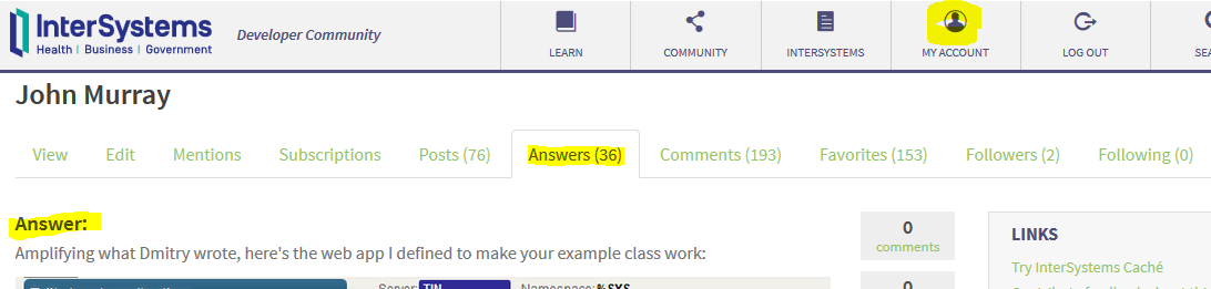
To get to the question, first I have to click on the "Answer:" text (which only gets the appearance of a hyperlink when I mouse over it).
That click takes me here:
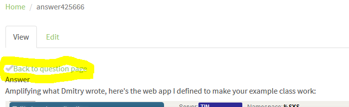
I now need to click on "Back to question page" in order to get where I want to be.
I suggest you put the "Back to question page" and its preceding checkmark (which denotes whether or not my answer was accepted) onto the "Answers" summary page in place of the "Answer:" hyperlink that doesn't look like a hyperlink.
Discussion (2)2
Comments
Fair enough. Filed, thanks.
This is fixed with new DC release.