Hello!

This article is a small overview of a tool that helps to understand classes and their structure inside the InterSystems products: from IRIS to Caché, Ensemble, HealthShare.

In short, it visualizes a class or an entire package, shows the relations between classes and provides all the possible information to developers and team leads without making them go to Studio and examine the code there.

If you are learning InterSystems products, reviewing projects a lot or just interested in something new in InterSystems Technology solutions — you are more than welcome to read the overview of ObjectScript Class Explorer!

21 35
3 5.5K
Article
· Dec 22, 2016 2m read
The Polymetric Dashboard

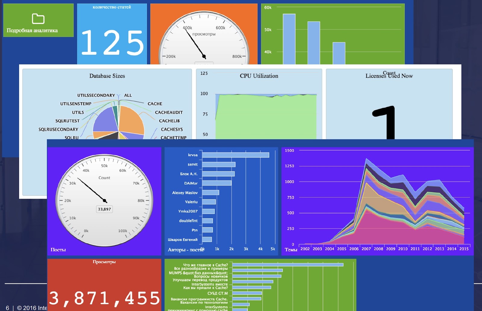
> Customizable System Monitoring. ## Introduction The Polymetric Dashboard is a stand-alone module that provides enhanced monitoring tools for a Caché environment. Equipped with over one hundred sensors that monitor key system metrics, a robust REST API, and a modular AngularJS user interface, the Polymetric Dashboard is fully functional out of the box. However, the Polymetric Dashboard is designed to be customizable; any system metric can be monitored by creating a new sensor, and the visualization of collected data can be tailored to specific requirements and purposes.

9 20
1 1.5K

There are several options how to deliver user interface(UI) for DeepSee BI solutions. The most common approaches are:

  • use native DeepSee Dashboards, get web UI in Zen and deliver it in your web apps.
  • use DeepSee REST API, get and build your own UI widgets and dashboards.

The 1st approach is good because of the possibility to build BI dashboards without coding relatively fast, but you are limited with preset widgets library which is expandable but with a lot of development efforts.

The 2nd provides you the way to use any comprehensive js framework (D3, Highcharts, etc) to visualize your DeepSee data, but you need to code widgets and dashboards on your own.

Today I want to tell you about yet another approach which combines both listed above and provides Angular based web UI for DeepSee Dashboards - DeepSee Web library.

3 16
5 2.1K
Article
· Feb 13, 2017 14m read
Creating custom SNMP OIDs

This post is dedicated to the task of monitoring a Caché instance using SNMP. Some users of Caché are probably doing it already in some way or another. Monitoring via SNMP has been supported by the standard Caché package for a long time now, but not all the necessary parameters are available “out of the box”. For example, it would be nice to monitor the number of CSP sessions, get detailed information about the use of the license, particular KPI’s of the system being used and such. After reading this article, you will know how to add your parameters to Caché monitoring using SNMP.

11 14
2 11K
Article
· May 11, 2021 8m read
IRIS in Astronomy

In this article we are going to show the results of the comparision between IRIS and Postgress when handling Astronomy data.

Introduction

Since the earliest days of human civilization we have been fascinated by the sky at night. There are so many stars! Everybody has dreamed about them and fantasized about life in other planets.

10 7
0 631

I built a dashboard to show hourly instrument capacities based on a term list. The term list consists of the TestInstrumentID and the number of tests that instrument can perform in 1 hour. The calculation works correctly and the data is accurate but periodically if you go to check the dashboard the percentages all get changed to 100% across every hour. If you check it later or add an additional site to the filter then the percentages correct themselves. I don't know what's causing this or how to troubleshoot it because it does calculate correctly but is not consistent.

0 6
0 186
Article
· Feb 1 2m read
Mind map your FHIR patient data

According Wikipedia a mind map is a diagram used to visually organize information into a hierarchy, showing relationships among pieces of the whole. It is often created around a single concept, drawn as an image in the center of a blank page, to which associated representations of ideas such as images, words and parts of words are added. Major ideas are connected directly to the central concept, and other ideas branch out from those major ideas.

2 6
0 113

I have a server with rusw locale but in my cube the time dimension shows dates such as "JAN-2018". Is there a way to either localize that (preferably) or just output numbers like "01-2018"?

Architect:

Analyzer:

Also in architect, in level settings there is a "Time Format" property, what's that? Tried setting it to 3 but it didn't help.

0 5
0 384

This is the first article of a series diving into visualization tools and analysis of time series data. Obviously we are most interested in looking at performance related data we can gather from the Caché family of products. However, as we'll see down the road, we are absolutely not limited to that. For now we are exploring python and the libraries/tools available within that ecosystem.

9 4
1 1.5K
Article
· Apr 19, 2023 2m read
Apache Superset now with IRIS

Apache Superset is a modern data exploration and data visualization platform. Superset can replace or augment proprietary business intelligence tools for many teams. Superset integrates well with a variety of data sources.

And now it is possible to use with InterSystems IRIS as well.

An online demo is available and it uses IRIS Cloud SQL as a data source.

6 4
0 605

Our team has had success creating and publishing Power BI reports using an ODBC connection to an IRIS database, but there have been concerns about the responsiveness of these reports.

As an attempt to improve responsiveness, I'm trying out the "DirectQuery" connection using the InterSystems IRIS connector available in our version of Power BI Desktop (September 2021).

The version of IRIS I'm connecting with is "IRIS for Windows (x86-64) 2022.2"

0 3
0 951

Hello everyone,

Is there a way to prettify the JSON streams in the incoming HTTP messages so that they are more readable in Visual Trace?

The HTTP messages sent by many software aren't prettified and are displayed like this in the Visual Trace:

On the other hand, other software like Postman prettify the messages and they are displayed in this way:

0 3
0 181

When we are at the starting stage of BI project development, we must remember that it is crucial to select the right tool for its implementation. Today we want to show you how one of the principal functionality of dashboards is implemented in different BI systems. Let's talk about drill down from both points of view: the dashboard development, and the convenience and clarity for the end user. We will touch on the applications of this technology in IRIS BI, Power BI and Tableau.

3 1
0 558
Article
· Dec 12, 2019 2m read
Creating Portlets in DeepSee

What is a portlet?

The simple answer is: a custom widget. A portlet can exist by itself on a DeepSee dashboard, it can be used along side standard DeepSee widgets, or along side other portlets. The rendering of the custom widget is completely user defined. This means you can embed a web page, create a form to perform any sort of action needed based on the data on your dashboard, use third party charting libraries, or simply display data from outside of a DeepSee cube.

How to get started

6 1
0 440