Visualization refers to the techniques used to communicate data or information by encoding it as visual objects (e.g., points, lines or bars) contained in graphics. The goal is to communicate information clearly and efficiently to users.
This article is a small overview of a tool that helps to understand classes and their structure inside the InterSystems products: from IRIS to Caché, Ensemble, HealthShare.
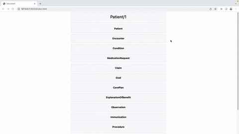
In short, it visualizes a class or an entire package, shows the relations between classes and provides all the possible information to developers and team leads without making them go to Studio and examine the code there.
If you are learning InterSystems products, reviewing projects a lot or just interested in something new in InterSystems Technology solutions — you are more than welcome to read the overview of ObjectScript Class Explorer!
This post is dedicated to the task of monitoring a Caché instance using SNMP. Some users of Caché are probably doing it already in some way or another. Monitoring via SNMP has been supported by the standard Caché package for a long time now, but not all the necessary parameters are available “out of the box”. For example, it would be nice to monitor the number of CSP sessions, get detailed information about the use of the license, particular KPI’s of the system being used and such. After reading this article, you will know how to add your parameters to Caché monitoring using SNMP.
In this article we are going to show the results of the comparision between IRIS and Postgress when handling Astronomy data.
Introduction
Since the earliest days of human civilization we have been fascinated by the sky at night. There are so many stars! Everybody has dreamed about them and fantasized about life in other planets.
This is the first article of a series diving into visualization tools and analysis of time series data. Obviously we are most interested in looking at performance related data we can gather from the Caché family of products. However, as we'll see down the road, we are absolutely not limited to that. For now we are exploring python and the libraries/tools available within that ecosystem.
> Customizable System Monitoring. ## Introduction The Polymetric Dashboard is a stand-alone module that provides enhanced monitoring tools for a Caché environment. Equipped with over one hundred sensors that monitor key system metrics, a robust REST API, and a modular AngularJS user interface, the Polymetric Dashboard is fully functional out of the box. However, the Polymetric Dashboard is designed to be customizable; any system metric can be monitored by creating a new sensor, and the visualization of collected data can be tailored to specific requirements and purposes.
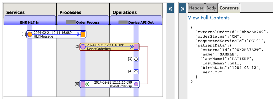
I would like to share with you a little trick to customize how messages are displayed in the Message Viewer. In particular, how you can display messages as JSON (instead of the default XML representation).
Apache Superset is a modern data exploration and data visualization platform. Superset can replace or augment proprietary business intelligence tools for many teams. Superset integrates well with a variety of data sources.
And now it is possible to use with InterSystems IRIS as well.
An online demo is available and it uses IRIS Cloud SQL as a data source.
The simple answer is: a custom widget. A portlet can exist by itself on a DeepSee dashboard, it can be used along side standard DeepSee widgets, or along side other portlets. The rendering of the custom widget is completely user defined. This means you can embed a web page, create a form to perform any sort of action needed based on the data on your dashboard, use third party charting libraries, or simply display data from outside of a DeepSee cube.
Millions of professionals use a wonderful tool, spreadsheets, for engineering calculations and financial analysis. It attracts a user-friendly interface and clear data organization. Cell formulas provide rich opportunities for automating calculations. No programming is required.
In last week's discussion we created a simple graph based on the data input from one file. Now, as we all know, sometimes we have multiple different datafiles to parse and correlate. So this week we are going to load additional perfmon data and learn how to plot that into the same graph.
Since we might want to use our generated graphs in reports or on a webpage, we'll also look into ways to export the generated graphs.
This post is a introduction of my openexchange iris-python-apps application. Build by using Embedded Python and Python Flask Web Framework. Application also demonstrates some of the Python functionalities like Data Science, Data Plotting, Data Visualization and QR Code generation.
Features
Responsive bootstrap IRIS Dashboard
View dashboard details along with interoperability events log and messages.
In a previous question, I have illustrated a few problems using Embedded Python interactively as you would do from Docker console or IRIS terminal. Investigation of the causes brought a rather clear picture. It's a classic impedance mismatch
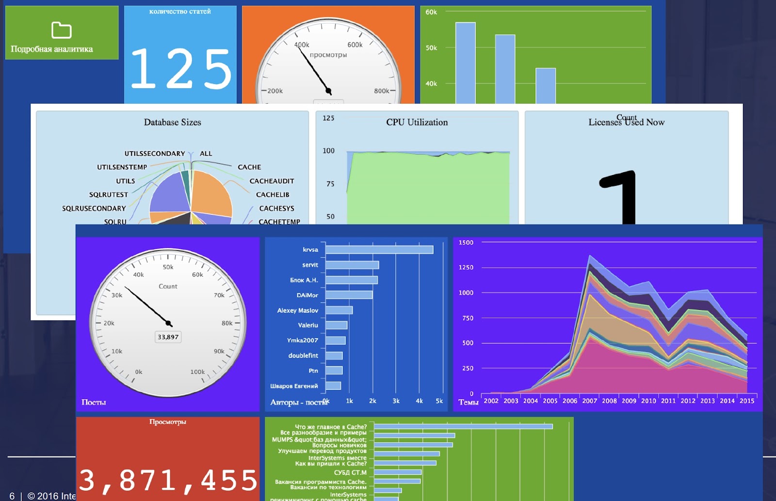
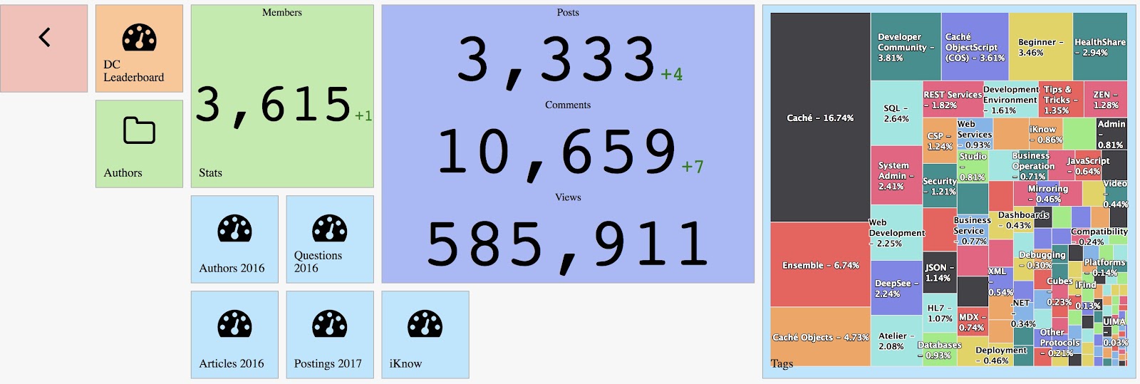
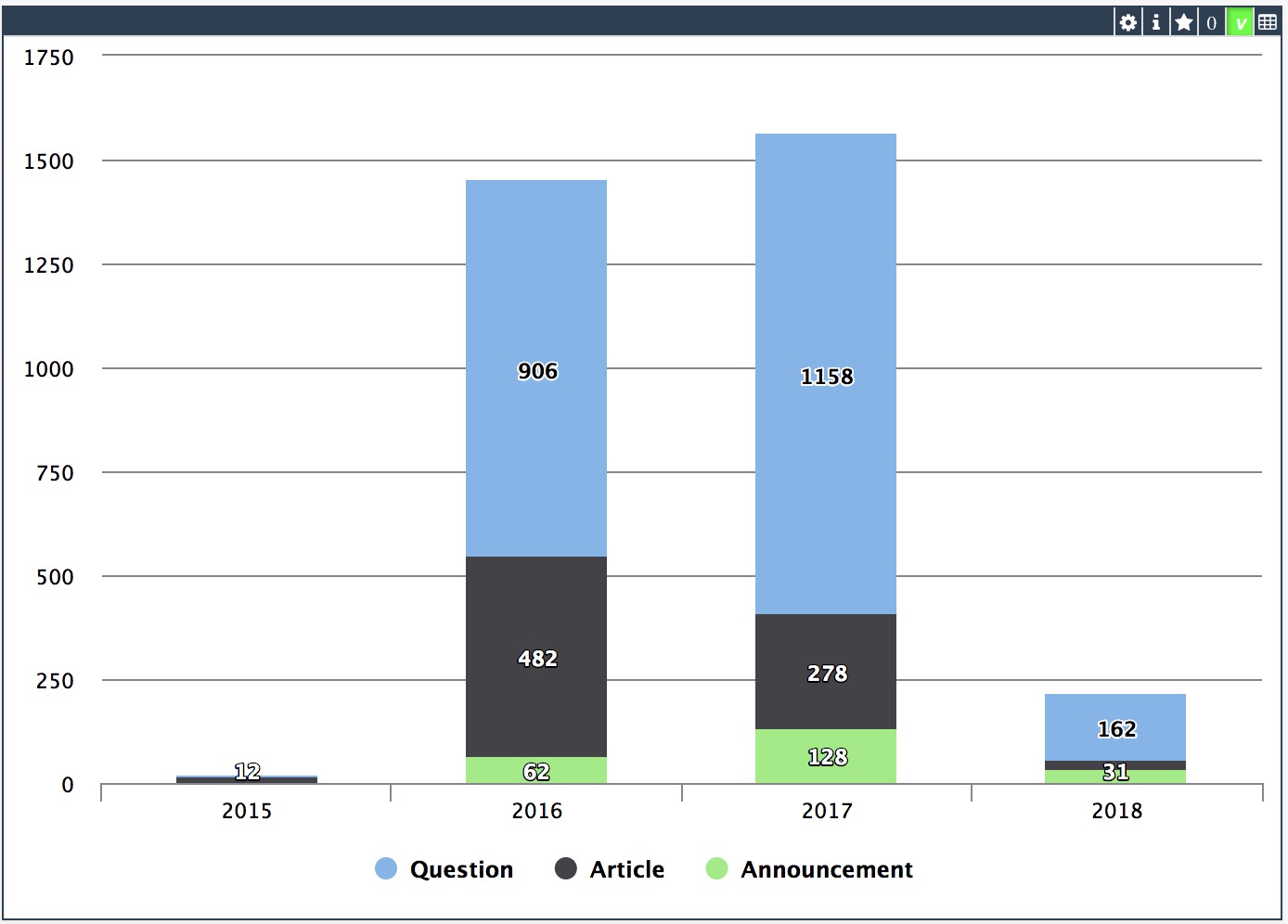
Today we will talk about InterSystems Reports. This is a BI system that provides you with tools to create static reports and export them to different file formats. We will see how it works using the DC Analytics public analytical sample as an example. In this article, we will examine how to familiarize yourself with the reports available in the repository, how to make a new report based on a ready-made data structure, and how to prepare a data structure from scratch.
When we are at the starting stage of BI project development, we must remember that it is crucial to select the right tool for its implementation. Today we want to show you how one of the principal functionality of dashboards is implemented in different BI systems. Let's talk about drill down from both points of view: the dashboard development, and the convenience and clarity for the end user. We will touch on the applications of this technology in IRIS BI, Power BI and Tableau.
There are several options how to deliver user interface(UI) for DeepSee BI solutions. The most common approaches are:
use native DeepSee Dashboards, get web UI in Zen and deliver it in your web apps.
use DeepSee REST API, get and build your own UI widgets and dashboards.
The 1st approach is good because of the possibility to build BI dashboards without coding relatively fast, but you are limited with preset widgets library which is expandable but with a lot of development efforts.
The 2nd provides you the way to use any comprehensive js framework (D3, Highcharts, etc) to visualize your DeepSee data, but you need to code widgets and dashboards on your own.
Today I want to tell you about yet another approach which combines both listed above and provides Angular based web UI for DeepSee Dashboards - DeepSee Web library.
https://www.youtube.com/embed/1pdzlCDrabo [This is an embedded link, but you cannot view embedded content directly on the site because you have declined the cookies necessary to access it. To view embedded content, you would need to accept all cookies in your Cookies Settings]
Code coverage and performance optimization of code has come up a bunch of times already, so most of you should already be aware of the SYS.MONLBL utility.
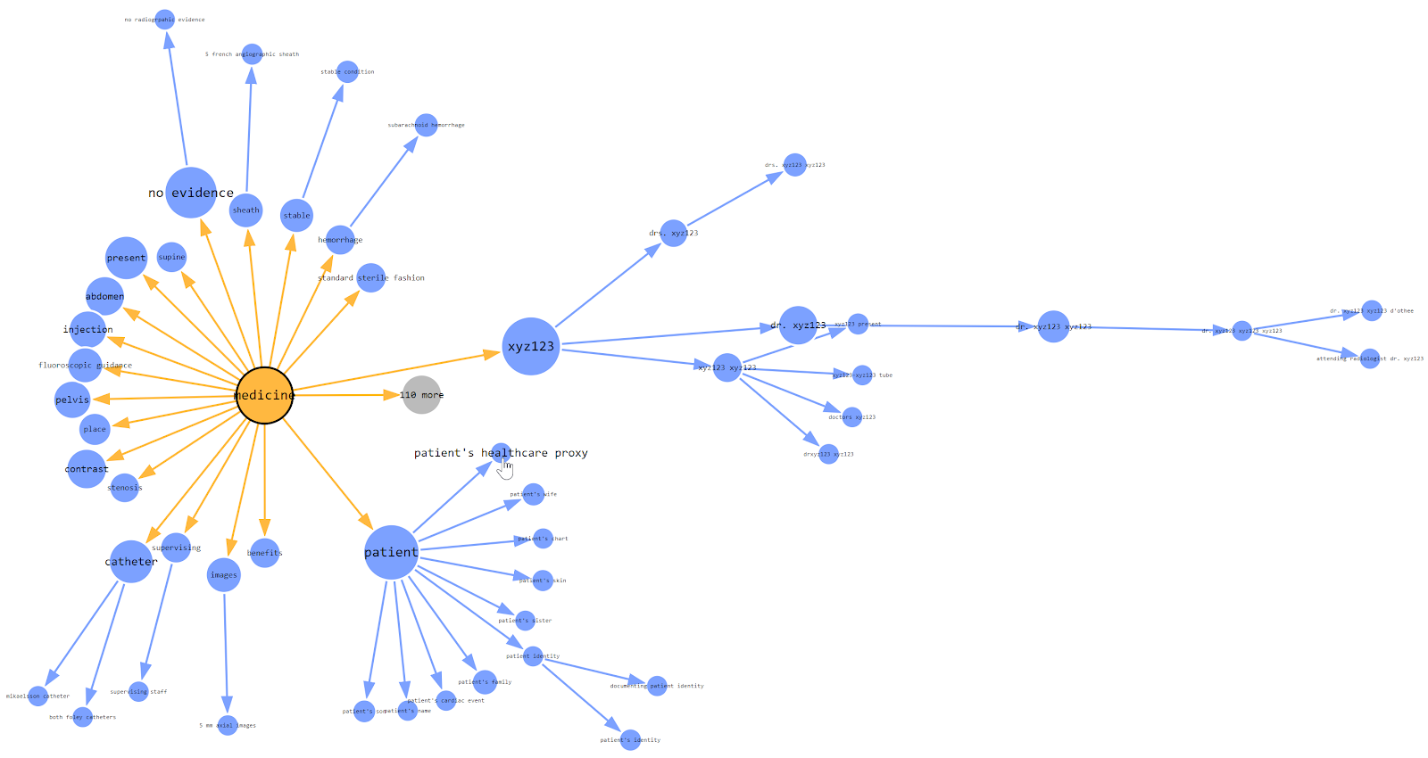
According Wikipedia a mind map is a diagram used to visually organize information into a hierarchy, showing relationships among pieces of the whole. It is often created around a single concept, drawn as an image in the center of a blank page, to which associated representations of ideas such as images, words and parts of words are added. Major ideas are connected directly to the central concept, and other ideas branch out from those major ideas.
By design, DSW provides an implementation for every widget in DeepSee library. But there are some extra features in DSW which make solutions built with DSW dashboards more functional. This article describes it.
I am documenting a demo of InterSystems IRIS featuring Embedded Python and Jupyter Notebook deployed on the same container, and an Embedded Python application developed on that Jupyter Notebook IDE.
In the previous part of this series, we saw how to define a basic portlet. Now we will look into making this portlet reference a web page that will enhance our dashboard experience.
In this example, we will be embedding a Developer Community article along side a couple of widgets displaying information related to the number of views on the Developer Community articles. This example is not hosted on the Community Analytics server, but if it was we could see the view counts going up as we interacted with the page.
Why use this?
In a real case, perhaps you have an embedded page from an external web site showing the current Emergency Room wait times for Hospitals in your area. This portlet can be used along side widgets from your Emergency Room showing how many people are waiting, how many doctors are active, and how many people are being treated. As other Emergency Room wait times grow, you can possibly expect your volume to increase as well. This can help you make decisions on how to allocate resources.
 By update
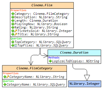 Hello!
 Open Exchange app
.png)